
Run a SaaS Pricing Page Decision-Support Publish Gate
A SaaS pricing page is ready for decision-support QA when a buyer can identify the plans, compare feature rows, understand usage limits, separate add-ons, and follow the same comparison path on desktop and mobile.
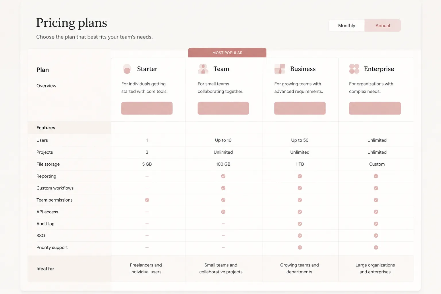
Run the gate in this order:
- Desktop comparison pass
- Mobile reflow pass
- Content and consistency pass
- Structural and semantic pass
- Keyboard and focus pass
- Supporting asset pass
- Final publish decision
This process checks what the page shows and how the buyer reaches it. It does not establish formal accessibility conformance, legal status, conversion impact, or revenue results.
Start With the Buyer’s Comparison Task
Before inspecting styling, write down what the buyer must decide from the page:
- Which plans are available?
- What is included in each plan?
- Which features differ by tier?
- What usage limits apply?
- Which costs are separate add-ons?
- Which conditions require an interaction, such as a toggle, selector, tooltip, or modal?
- What action follows comparison?
Use this brief as the review reference. Each visible block should answer one of these questions or explain a necessary condition.
A page can contain the right information and still make comparison difficult. Plan names may appear in one row, prices in another, and feature explanations inside separate panels. Check whether the buyer can connect those pieces without reconstructing the offer manually.
Run the Desktop Comparison Pass
Inspect the widest common desktop layout first. Review the pricing table as a buyer would scan it, from plan columns through feature rows and supporting notes.
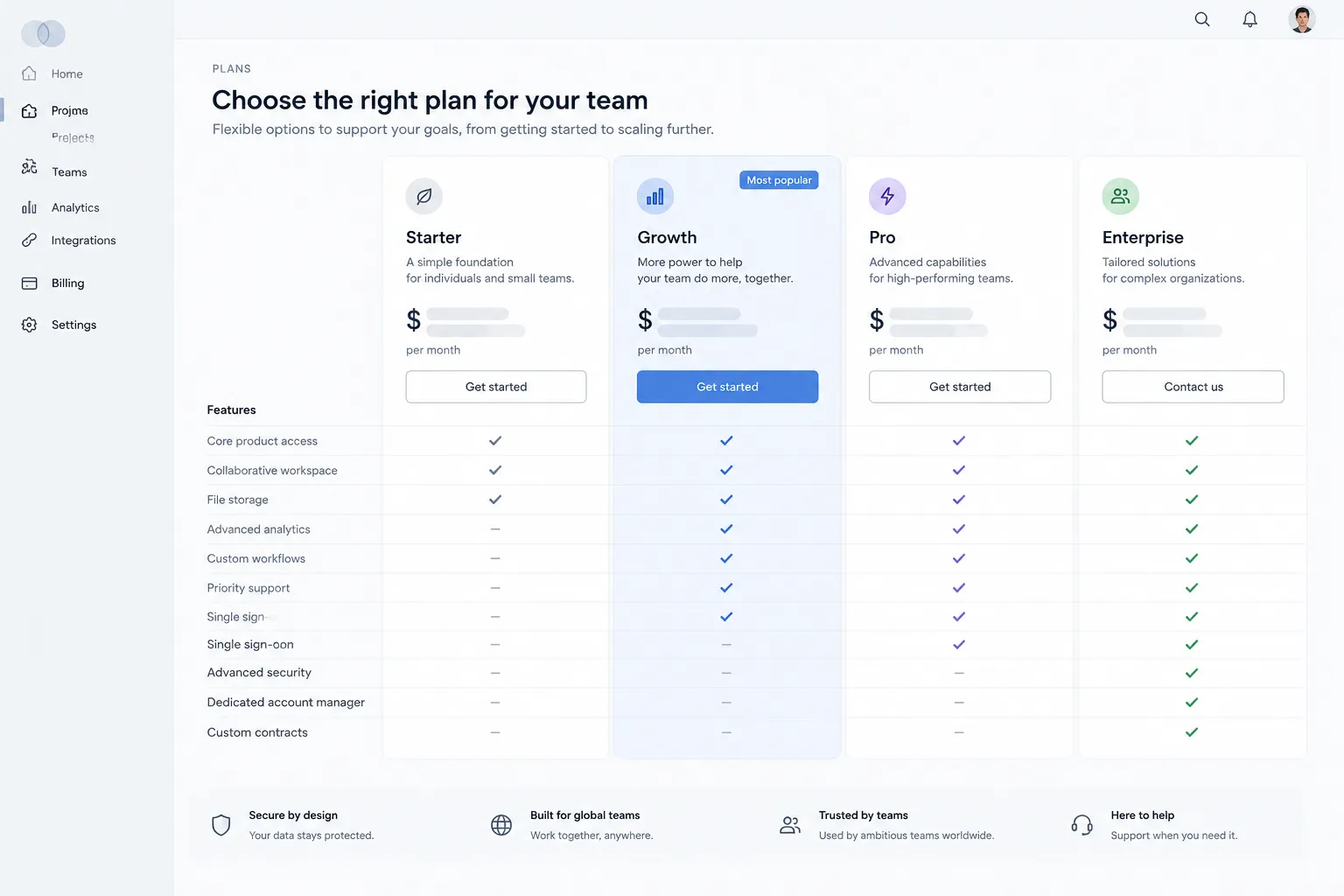
Plan Columns
Each plan column needs a clear tier cue. Check whether:
- The plan name is visually associated with its price.
- The billing period and currency appear near the price.
- Primary limits stay connected to the plan they describe.
- The action for each plan remains associated with that plan.
- Recommended treatment does not obscure other plan differences.
- Sales-led and contact-based plans are labeled differently from self-serve plans.
- Trial, free, usage-based, and custom options do not appear to share identical purchase paths.
A highlighted column can direct attention, but it should not become the only legible column. Emphasis supports comparison only when the surrounding columns remain available for inspection.
Feature Rows
Check whether feature rows use stable categories and consistent labels. A buyer should be able to move across one row and understand how the same feature changes between plans.
- Repeated feature names mean the same thing.
- Included, excluded, and limited states use consistent symbols or text.
- Usage limits include their unit and time window.
- Explanations remain close to the relevant feature.
- Row groups distinguish core features from administrative or support features.
- Blank cells have an explained meaning.
- A feature omitted from one comparison location has a clear reason.
Do not rely on shading alone to communicate relationships. Comparison-table research suggests that grouping and visual treatment can influence information acquisition, but it does not establish one universal pricing-table layout. Treat shading as a support cue, then verify that labels, headings, and row order carry the comparison independently.
Add-On Blocks
Add-ons need their own inspection pass when they carry separate pricing or eligibility conditions. Confirm that each add-on shows:
- Its name and pricing method
- Its unit, such as per user, per seat, or usage period
- The plans that can use it
- Whether it is optional or required
- Any relevant limit or dependency
- Where the buyer can add or configure it
Do not place an add-on inside a plan column without labeling its separate cost. That shortcut can hide what the buyer must calculate. If add-on features differ from the main feature set, use a separate grouping or table structure so the buyer can distinguish the add-on from the base plan.
Run the Mobile Reflow Pass
A narrow viewport is a separate review context. A desktop table compressed into tiny columns is not automatically usable reflow.
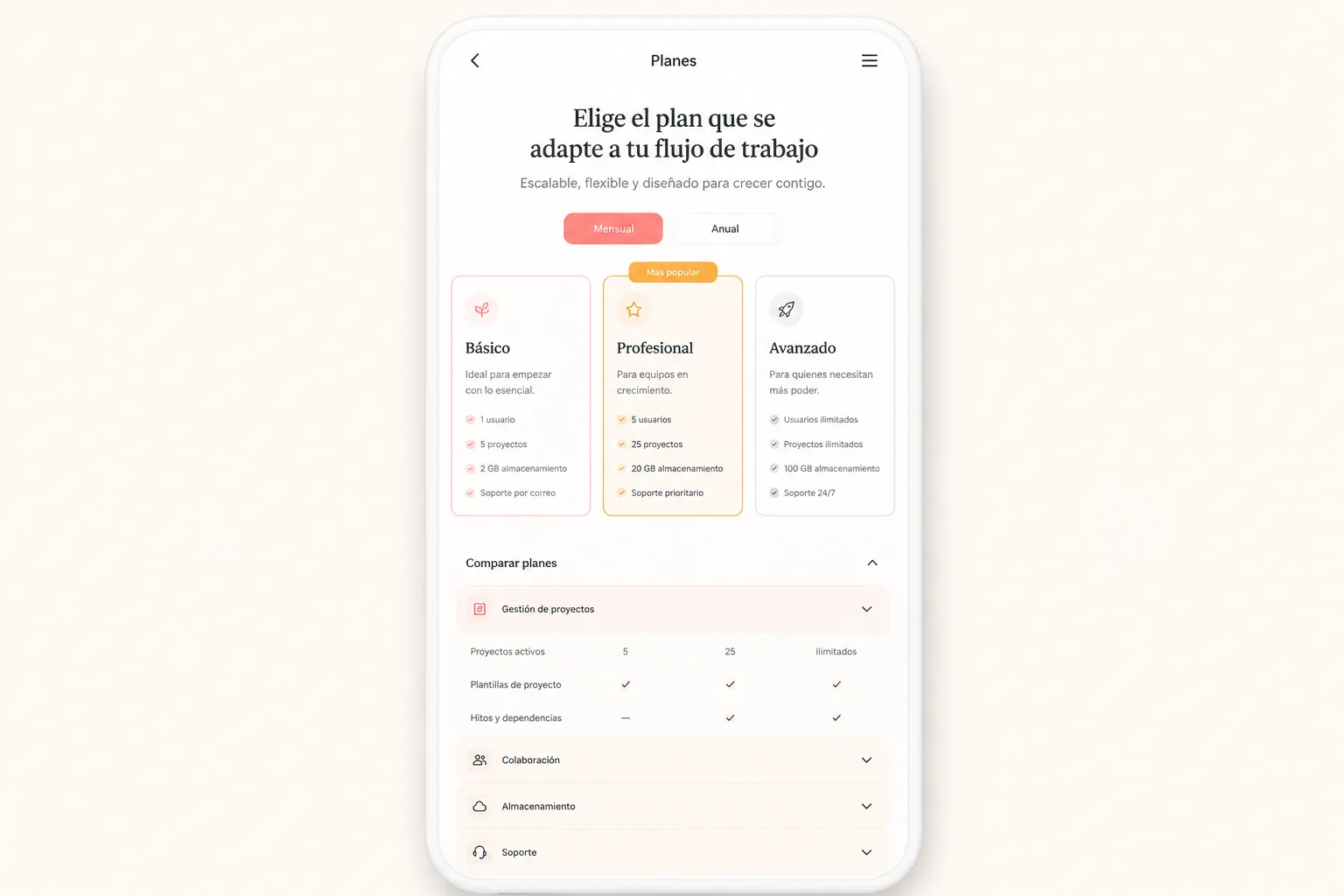
In a mobile pass, check whether the buyer can:
- Read each plan name and price without clipping.
- Identify which feature value belongs to which plan.
- Review limits with their units and billing periods.
- Reach add-on details without losing the relevant plan context.
- Open and close dynamic content without missing information.
- Use controls without scrolling that prevents practical comparison.
- Continue from comparison to the intended action.
Use the W3C reflow guidance as an inspection boundary: relevant content should remain usable at a narrow width without problematic two-dimensional scrolling. This check does not establish that every applicable requirement has been met.
Check Collapsed Content
Mobile layouts often collapse feature rows, stack plan cards, or hide secondary details behind controls. For every collapsed section, verify that:
- The control identifies what it reveals.
- The current state is visible.
- The revealed content remains associated with the correct plan or row.
- Closing the section does not remove the buyer’s comparison position.
- Important prices, limits, and conditions are not available only through an unclear interaction.
Content that appears after a click, toggle, or modal can be missed during a screenshot review. Make the interaction path visible, repeatable, and part of the review record.
Run the Content and Consistency Pass
Compare the pricing table with plan cards, feature summaries, add-on blocks, FAQs, checkout or signup labels, billing controls, tooltips, modals, expanded details, and structured page content.
Look for mismatches in:
- Plan names
- Feature availability
- Usage limits
- Prices and billing periods
- Add-on eligibility
- Interaction-dependent prices or conditions
Can the reviewer explain this plan without consulting another page?
If the answer is no, record the missing information and identify where it belongs. Research on SaaS pricing structures supports this inspection prompt, but it does not establish a winning page format or a commercial result.
Pay particular attention to a limit shown as a feature in one location and a restriction elsewhere, a price that changes after a billing toggle, an add-on described as both included and optional, or a plan name that appears to belong to another product.
Run the Structural and Semantic Pass
A visual review asks whether the page looks connected. A structural pass asks whether the published relationships are represented clearly in the page structure.
- Headings follow a logical sequence.
- Pricing tables have meaningful headers.
- Feature rows retain their relationship to plan columns.
- Add-ons are grouped under an identifiable heading.
- Labels describe controls and values.
- Explanatory text is connected to the relevant item.
- Decorative elements do not carry essential pricing information.
- The mobile structure preserves the same relationships as the desktop structure.
The W3C guidance on information and relationships provides a useful boundary here. Headings, labels, groups, and table relationships should remain meaningful in the underlying structure, not only in visual placement.
A screenshot cannot confirm every structural relationship, and automated checks cannot replace inspection of the buyer’s comparison path. Record visual findings separately from implementation findings.
Run the Keyboard and Focus Pass
Use the page without a pointer. Start at the beginning of the pricing content and move through every interactive element.
Check whether the keyboard user can:
- Reach plan selectors and billing controls.
- Open feature details and add-on information.
- Operate expanded and collapsed sections.
- Reach each plan action.
- Understand the order of interactive elements.
- See which control currently has focus.
- Return to the comparison point after closing a dialog or panel.
- Avoid being trapped inside a component.
A visible focus indicator should remain distinguishable against the page background and surrounding content. This is a practical QA check, not a complete accessibility evaluation or a statement about legal status.
Run the Supporting Asset Pass
Supporting assets include diagrams, feature illustrations, plan badges, FAQ graphics, and explanatory images. Review each asset according to the question it answers on the page.
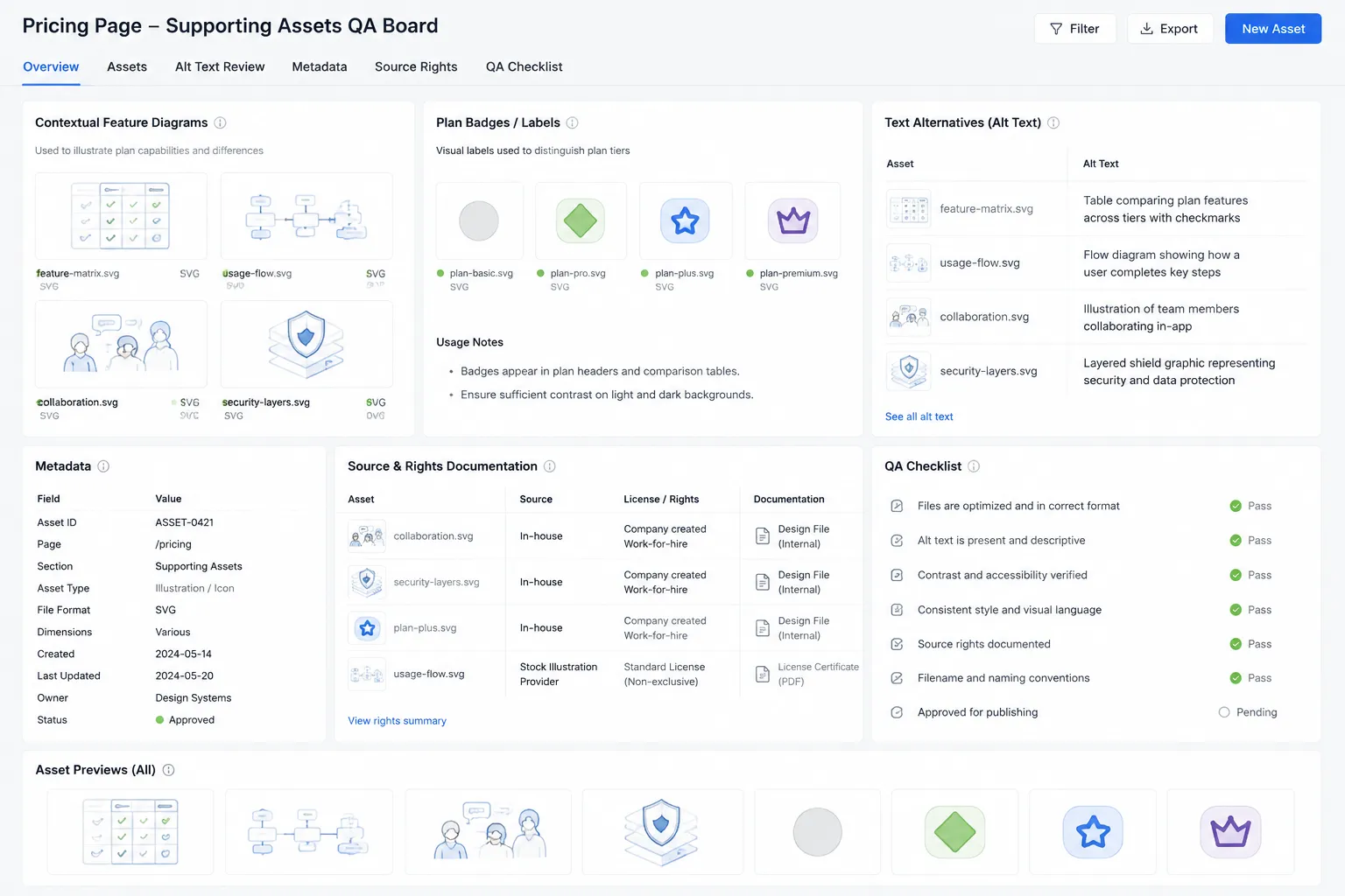
For every asset, record:
- What information it adds
- Which plan, feature, or add-on it supports
- Whether nearby text provides sufficient context
- Whether a text alternative is needed
- Whether it remains understandable on mobile
- Whether source and usage rights are documented internally
- Whether its filename, metadata, and surrounding copy match the published subject
Do not use an image to carry a price, limit, or eligibility condition that is unavailable elsewhere. A buyer comparing plans needs that information in readable page content.
Keep source-rights notes in the production record. Practical asset handling remains separate from legal rights advice, so verify ownership and permission details through the team’s publishing process.
Record the Publish Decision
Publish
Choose this when the buyer can compare the required plans, features, limits, add-ons, and actions across the reviewed states. Desktop and mobile content remains usable, interactions reveal their states, and no unresolved mismatch affects the comparison.
Revise Before Publishing
Choose this when the page contains the information but creates avoidable ambiguity. Common reasons include:
- Plan headings lose association with prices.
- Feature rows use inconsistent labels.
- Add-on costs are not separated.
- Usage limits omit units or time windows.
- Mobile content is clipped or difficult to compare.
- Important details appear only after an unclear interaction.
- Focus is difficult to locate.
- Supporting assets lack context or usable text alternatives.
- The visible page and related content disagree.
Assign each issue to a page element and a next check. “Improve the table” is too broad. “Keep the billing period beside each plan price on mobile” is brief-ready.
Block
Choose this when a buyer cannot determine a required comparison fact, an interaction hides essential pricing information, or a mismatch creates uncertainty about what the plan includes.
A block should state:
- The missing or conflicting information
- The affected plan, row, or add-on
- The viewport or interaction state where it appears
- The owner of the revision
- The verification needed before reopening the gate
What This Gate Can and Cannot Show
This SaaS pricing page decision support publishing QA process can show whether the page presents a coherent comparison path under defined review conditions. It can identify visible layout problems, unclear labels, missing relationships, interaction-dependent content, and asset-handling gaps.
It cannot show that every accessibility requirement is met, that the page has a particular legal status, or that a visual choice will produce a particular commercial outcome. The available material provides standards guidance, limited comparison-table context, and indirect SaaS pricing-structure terminology. It does not provide a verified SaaS pricing-page teardown, firsthand test, implementation case, or professional review.
Before publishing, preserve the checked viewport states, interaction paths, content versions, unresolved issues, asset notes, and final decision. The gate is complete when another reviewer can repeat the comparison and reach the same page-level conclusion.
Sources
- Web Content Accessibility Guidelines (WCAG) 2.2
- Understanding Success Criterion 1.4.10: Reflow
- Understanding Success Criterion 1.3.1: Info and Relationships
- The Design of Product Comparison Tables and its Effects on Decision Making
- From Static to Intelligent: Evolving SaaS Pricing with LLMs
- Automated Analysis of Pricings in SaaS-based Information Systems