
Comparison Semantics, Accuracy, and Publishing QA
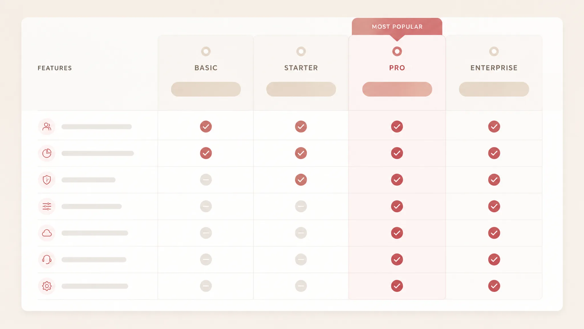
A pricing table can look orderly while still making plan differences difficult to inspect. The visible grid may align columns, while the underlying HTML leaves unclear which cells belong to each plan or feature.
For a buyer comparing plans, that relationship is the starting point. A plan column identifies the tier, a feature row identifies the capability, and each value needs to remain connected to both. That connection also needs review through keyboard navigation, responsive changes, content updates, and the final publishing pass.
This guide treats accessible comparison table testing as a production workflow for SaaS teams. It covers semantic HTML, header relationships, keyboard and assistive-technology checks, mobile behavior, feature accuracy, source-rights notes, and prepublish review. The supplied references explain table semantics and testing boundaries; they do not assess a particular SaaS pricing page or establish buyer comprehension.
Start With the Buyer’s Comparison Task
Before inspecting markup, define what a buyer must be able to compare. A typical SaaS pricing table contains several distinct relationships:
- The plan column identifies a subscription tier.
- The feature row identifies a capability, limit, or condition.
- The cell states whether that feature applies to the plan.
- A tier cue highlights a recommended, popular, or otherwise emphasized option.
- An add-on block explains items outside the main plan structure.
- Supporting notes clarify billing intervals, usage limits, exclusions, or eligibility.
These elements should not compete for the same meaning. A highlighted plan does not automatically include every feature nearby. An icon does not automatically explain whether a feature is included, limited, or available for an additional charge.
Start with a short comparison brief:
| Planning question | What to record |
|---|---|
| What are the plans? | Exact plan names and billing context. |
| What are the rows? | Features, limits, integrations, or service conditions. |
| What does each cell mean? | Included, unavailable, limited, variable, or add-on. |
| Which details need context? | Footnotes, usage units, billing terms, or eligibility. |
| What changes on mobile? | Order, visibility, scrolling, stacking, or collapsed content. |
| What must be verified before publishing? | Markup, keyboard behavior, content, assets, and source notes. |
This brief gives the QA pass something specific to inspect. Without it, reviewers may confirm that the table renders while missing an unclear tier cue, an ambiguous icon, or an add-on that appears to belong to the base plan.
Pricing Table Semantic HTML QA
Semantic HTML describes relationships in the structure, not only in the visual treatment. Guidance from W3C and MDN supports reviewing table context, header cells, scope, and more complex header-cell relationships where the structure requires them.
For a SaaS comparison table, the first inspection pass should answer four questions:
- Does the table have an identifiable purpose?
- Are plan names represented as column headers?
- Are feature names represented as row headers?
- Can each data cell be associated with the relevant plan and feature?
A visual grid may show these relationships through borders, spacing, color, or alignment. Those signals are not automatically available in the document structure. Review the rendered page and the HTML together.
Add Table Context
A buyer should know what the table compares before reading individual cells. A caption can provide the table’s visible title, while nearby introductory text can add context when the caption alone is insufficient.
Useful context may identify subscription plans and included features, monthly or annual billing conditions, the account type covered, whether add-ons appear separately, and whether blank cells mean unavailable features or missing information.
A page heading can introduce the section, but it should not substitute for an identifiable table purpose when the relationship is unclear in the markup.
Identify Column Headers
Plan names usually occupy the top header row. Each plan column should remain identifiable when the table is inspected structurally.
- Use header cells for plan names rather than ordinary data cells.
- Keep billing intervals attached to the correct plan context.
- Do not let a badge such as “Popular” replace the plan name.
- Do not make an icon the only version of a tier label.
- Check that the header remains understandable without color or background styling.
- Give grouped headings a clear relationship to the plan headers beneath them.
A tempting shortcut is to place plan names in styled <div> elements above separate columns. That may look correct on the page, but it can weaken the connection between a feature value and its plan.
Identify Row Headers
Feature names usually occupy the first cell of each comparison row. They should remain distinguishable from the values that describe them.
- Give each feature row a readable label.
- Include units with usage limits.
- Group similar features under meaningful section labels.
- Do not rely on a tooltip alone for a row label.
- Keep the first column associated with the data cells on narrow screens.
- Mark add-on rows as add-ons rather than presenting them as ordinary inclusions.
“Seats” may be incomplete without a unit or condition. “Seats included” and “Additional seats” may require different row labels even when both use numeric values.
Use Associations That Match the Structure
Simple tables can often use row and column scope to express header relationships. More complex tables may need explicit header and data-cell associations. The choice depends on the actual structure, so inspect the relationship before applying attributes mechanically.
Complexity can arise from multiple header rows, grouped plans, grouped feature categories, spanning headers, several dimensions in one grid, sub-rows beneath a feature group, or add-on columns mixed with base-plan columns.
The question is whether each data cell can be understood in relation to the correct headers. Do not add complexity without a reason, but do not reduce a complex structure to ordinary cells because the visual layout appears obvious.
Compare the Rendered Layout With the HTML
Pricing table semantic HTML QA needs two views: the rendered page and the underlying document structure. Review them together because a table can show one grouping visually while the markup exposes another order or incomplete association.
| Page requirement | Rendered check | HTML check |
|---|---|---|
| Plan columns | Names and billing terms are visible. | Plan cells act as column headers. |
| Feature rows | Labels are readable and grouped. | Feature cells act as row headers where appropriate. |
| Included status | Symbols or text have an understandable meaning. | Values remain associated with both headers. |
| Add-ons | Additional charges are visually separated. | Add-on content is not mistaken for base-plan content. |
| Footnotes | Notes appear near the relevant claim. | References and labels remain meaningful. |
| Responsive order | The comparison sequence remains understandable. | DOM order supports the intended reading sequence. |
This comparison catches implementation drift. A content editor may rename a plan while a hidden label still uses the previous name. A designer may move a feature group visually while the document order stays unchanged.
Comparison Table Keyboard Testing
Keyboard testing is a separate workstream from semantic inspection. Table headers and associations do not establish that billing toggles, expandable details, tooltips, plan selectors, or add-on controls can be reached, understood, and operated.
In a keyboard pass, inspect the complete comparison task:
- Start before the pricing table.
- Move through the page using the keyboard.
- Record the focus order.
- Confirm that each interactive control receives visible focus.
- Operate billing switches, expandable details, and plan actions.
- Check whether focus moves unexpectedly after an interaction.
- Confirm that no control traps focus.
- Repeat the pass after responsive changes.
Pay particular attention to controls that alter table content. When a billing toggle replaces prices or changes included features, the updated content should remain understandable at the point of interaction.
Check Focus Against the Comparison Order
The focus sequence should support the buyer’s task. A useful order often moves from table context, to billing or display controls, to plan headings, to feature groups and rows, then to plan-specific actions and supporting notes.
The correct sequence depends on the page structure. Define the intended order in the production brief before implementation review. Reaching a purchase action before the conditions that qualify the price can place the comparison in an unexpected sequence.
Responsive Pricing Table QA Checklist
A desktop comparison table does not automatically translate into a usable mobile view. The available material does not provide a tested SaaS mobile result, so mobile behavior belongs to practical production QA.
In a mobile pass, check:
- Whether plan names remain connected to their values.
- Whether feature labels remain visible near each value.
- Whether horizontal scrolling has an identifiable context.
- Whether the first column stays available while comparing plans.
- Whether columns become stacked sections.
- Whether hidden rows can still be discovered.
- Whether billing terms remain attached to the displayed price.
- Whether add-on content remains visibly separate.
- Whether long feature names wrap without obscuring values.
- Whether controls remain reachable and operable.
- Whether the page preserves a meaningful reading sequence.
Choose a Mobile Comparison Model
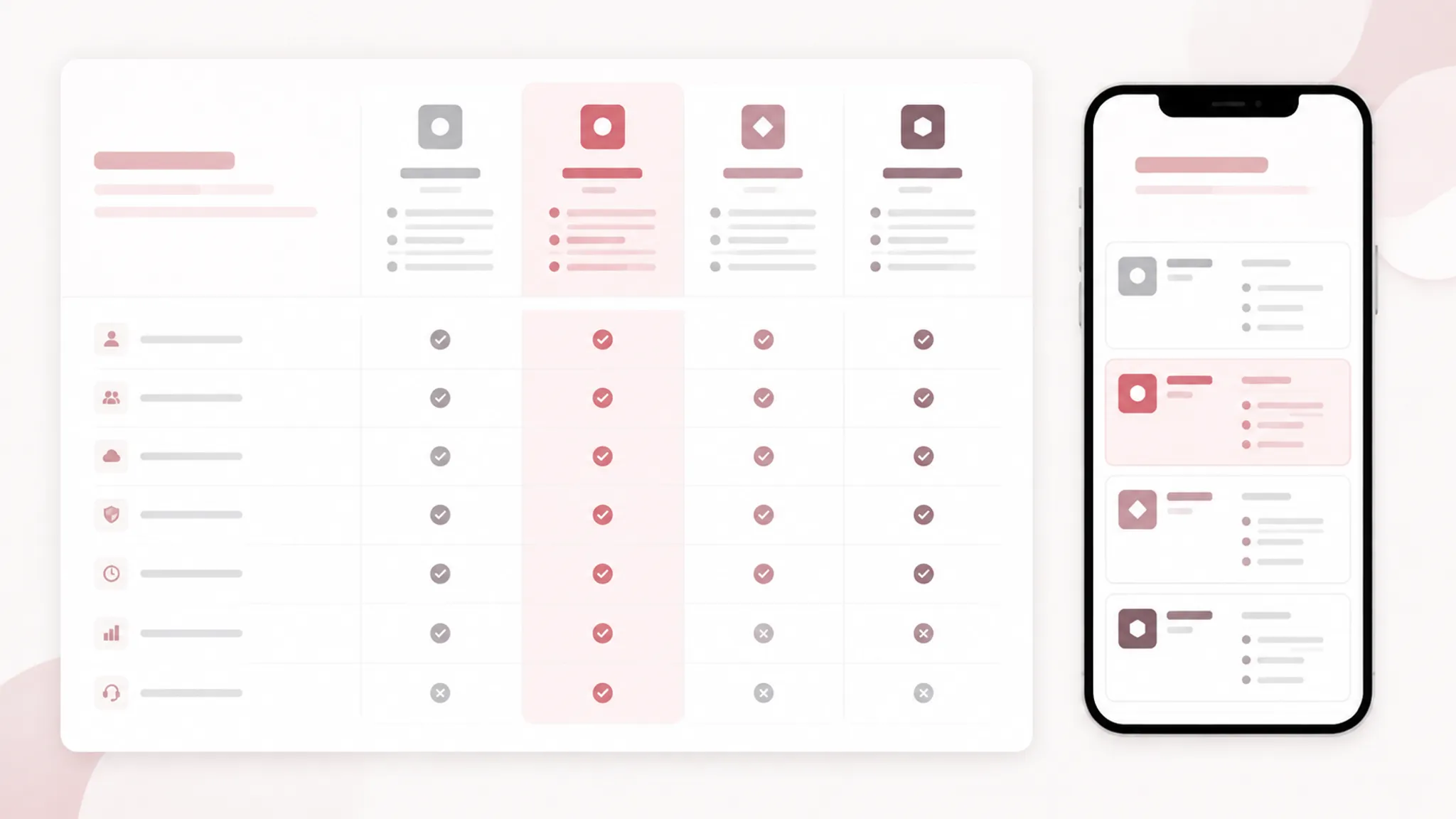
Select the mobile model from the buyer’s task, not from the desktop layout alone. Common models include a horizontally scrollable table, one plan shown at a time with a selector, stacked plan sections, a reduced comparison table with a separate details view, or a feature-first view that preserves row labels while changing column presentation.
Each model creates different review questions. Horizontal scrolling requires clear plan context. Stacked sections require repeated feature labels or another way to preserve relationships. A reduced table requires a record of what moved or was removed.
No model is universally preferable. The test is whether the selected structure preserves the intended plan-and-feature relationships at the target viewport sizes.
Feature Comparison Content Accuracy Audit
A pricing table is also a content system. Semantic correctness cannot compensate for inaccurate feature information.
Before publishing, compare the table against the current approved product and pricing brief. Use a row-level audit rather than reviewing only the plan cards.
- Plan names and order.
- Price values and currency display.
- Billing interval labels.
- Trial or introductory conditions.
- Usage limits and units.
- Included and excluded features.
- Feature variations between tiers.
- Add-on availability and placement.
- Footnotes and qualification language.
- Button labels and destination intent.
- Hidden or expandable details.
- Structured data or repeated content elsewhere on the page.
Record who supplied each value, which version was reviewed, and whether it is confirmed for the intended publication date. This is a production record, not a claim of external verification.
Test Ambiguous Cell States
A checkmark, dash, empty cell, or short label can carry different meanings. Define the state vocabulary before the table is written:
- Included.
- Not included.
- Available as an add-on.
- Available with a usage limit.
- Available only under a stated condition.
- Information not currently displayed.
The vocabulary must match the product facts. An empty cell should not mean both “not included” and “not yet reviewed.” Those states require different editorial handling.
When icons are used, pair them with text or an accessible name that explains the state. Color alone should not distinguish included and unavailable features.
Add-On Blocks and Tier Cues
Add-ons deserve their own planning decision because they can disrupt the base-plan comparison. An add-on block should make clear what the item is, which plans can use it, whether it changes the base price, whether it is optional or required, where its terms are explained, and how it relates to the main table.
A common layout shortcut is placing add-ons in the same grid as included features without a separate cue. The buyer may then read an additional item as a standard plan feature.
Tier cues also need a defined purpose. A “Popular” or “Recommended” label can draw attention, but it should not replace the plan name, price context, or feature information. Specify its location, wording, relationship to the plan header, and mobile behavior in the visual brief.
FAQ Assets and Trust Cues
FAQ illustrations and trust cues should answer questions raised by the pricing table. They should not introduce a second comparison system that conflicts with the grid.
An FAQ asset may clarify billing intervals, usage limits, add-on handling, plan changes, or feature terms that need fuller explanation. The asset brief should record its intended message, nearby text, alternative-text requirement, dimensions, and source-rights note.
Do not ask an illustration to communicate a precise feature matrix that belongs in text or table content. Trust cues also need a defined source and scope. A security mark, customer statement, or product badge should not be treated as support for a pricing claim unless the page has an approved basis for that claim.

Source-Rights Review for Pricing Page Assets
Source-rights review is separate from accessibility testing and content accuracy. For every image, illustration, icon set, screenshot, or badge near the pricing table, record:
- Asset name and location.
- Source or creator.
- Permission or license record.
- Required attribution.
- Modification status.
- Intended placement.
- Replacement asset, if applicable.
- Review owner and date.
This note supports the publishing workflow. It does not provide a legal conclusion. Do not assume that an asset is reusable because it appears widely elsewhere, and do not copy a trust mark, customer logo, or product screenshot into an add-on block without confirming its approved use.
Automated Checks and Manual Review
Automated tools can identify some potential accessibility issues, but they cannot settle every question about relationships, interaction, content meaning, or user experience.
The supplied academic material supports a layered evaluation approach in broader web contexts. It describes automated checks as a starting point and discusses the additional value of keyboard, resizing, assistive-technology, expert, and user review. Those studies are not tests of a SaaS pricing page.
Use automation for repeatable signals such as potentially missing table headers, invalid or inconsistent markup, missing labels, some focus and name-related issues, and structural patterns that need human confirmation.
Then add manual review for:
- Whether the table purpose is understandable.
- Whether the correct headers apply to each cell.
- Whether icons and empty states have clear meanings.
- Whether keyboard focus supports the comparison sequence.
- Whether the mobile model preserves plan context.
- Whether content matches the approved product brief.
- Whether source-rights records are complete.
- Whether dynamic updates remain understandable.
Treat automated output as findings to investigate. A reported issue may require contextual interpretation, and a passing result does not establish that the full pricing-page task works as intended.
A SaaS Pricing Page QA Workflow
- Define the comparison model.
List the plan columns, feature rows, tier cues, add-on blocks, billing controls, and supporting notes. Mark the relationships a buyer must preserve.
- Inspect table context.
Confirm that the table has an identifiable purpose and that captions, headings, and nearby text provide enough context.
- Inspect headers and associations.
Review column headers, row headers, scope, and more complex relationships where the structure requires them. Compare the HTML with the rendered grid.
- Review interaction behavior.
Run the keyboard pass through billing controls, expandable content, plan actions, and table navigation patterns. Record focus order and visible focus behavior.
- Run the mobile pass.
Inspect supported responsive states. Verify that plan names, feature labels, values, add-ons, and conditions remain connected.
- Audit content accuracy.
Compare every price, plan label, feature state, limit, footnote, and add-on against the approved source. Resolve ambiguous states before publication.
- Review assets and rights.
Check FAQ illustrations, product screenshots, trust cues, icons, source-rights records, and accessibility metadata requirements.
- Run automated checks.
Record findings with the page state, viewport, and content version. Separate confirmed issues from findings needing manual interpretation.
- Complete manual review.
Review the table as a buyer comparing plans, then inspect it with the chosen keyboard and assistive-technology checks. Tie observations to specific page behavior.
- Approve the publication state.
Record the reviewed page version internally, completed checks, unresolved issues, owners, and the decision to publish or revise.
What Belongs in the Production Brief
A usable brief gives design, content, and engineering the same comparison model. Include:
- Primary table purpose.
- Plan names and order.
- Feature groups and row labels.
- Cell-state vocabulary.
- Billing and usage context.
- Add-on treatment.
- Tier-cue rules.
- Mobile comparison model.
- Keyboard interaction requirements.
- Semantic HTML inspection points.
- Asset dimensions and alternative-text needs.
- Source-rights fields.
- Content owner and review status.
- Prepublish checks and unresolved questions.
The brief should distinguish requirements from preferences. Keeping each value associated with its plan and feature is a structural requirement. Using a stronger background for a recommended tier is a visual option that still needs review against the comparison task.
Common Concept Mix-Ups
- Visual alignment versus semantic association
- Columns that line up visually may not be associated in the HTML. Inspect both representations.
- A table caption versus a page heading
- A page heading can introduce a section, while table context identifies what the data grid represents.
- Semantic structure versus a full page review
- Headers and associations address an important part of comparison-table structure. They do not establish keyboard, assistive-technology, mobile, content, or interaction quality across the page.
- Automated result versus publication approval
- A tool report is one input to review. It is not a complete publishing decision.
- Add-on availability versus included feature status
- An add-on shown in the feature grid can be mistaken for an included plan feature. Give the distinction visible and structural treatment.
- A tier cue versus a pricing recommendation
- A label such as “Popular” communicates page emphasis. It does not replace the underlying plan details or establish a business outcome.
- A readable desktop table versus a mobile-ready table
- Responsive behavior can change order, visibility, and context. A desktop inspection cannot answer the mobile question alone.
A Practical Review Record
Keep the final review record concise enough to use repeatedly.
| Area | Status to record |
|---|---|
| Table context | Confirmed, revise, or not applicable. |
| Plan-column headers | Confirmed against the brief. |
| Feature-row headers | Confirmed against the brief. |
| Header-cell relationships | Reviewed in the implementation. |
| Keyboard pass | Completed with findings. |
| Assistive-technology pass | Completed, pending, or out of scope. |
| Mobile pass | Viewports and findings recorded. |
| Feature accuracy | Values checked against approved content. |
| Add-on treatment | Base-plan relationship confirmed. |
| Asset metadata | Alternative text and related fields reviewed. |
| Source-rights note | Evidence recorded internally. |
| Automated findings | Investigated and assigned. |
| Publication decision | Publish, revise, or hold. |
Use “not tested” when a check was not performed. Do not convert an untested area into a pass because the page looks correct. The final review question is whether the intended buyer comparison can be followed on the page and in the implementation.
FAQ
What is accessible comparison table testing?
It is a structured review of whether a comparison table exposes its intended relationships and interactions clearly. For a SaaS pricing page, that includes plan columns, feature rows, cell states, keyboard behavior, responsive presentation, and supporting content. It is broader than checking visible borders or aligned values.
Does semantic HTML make a pricing table accessible?
Semantic HTML supports the structure of the comparison, including header and data relationships. It does not by itself establish that the complete page works across keyboard, assistive technology, mobile layouts, dynamic controls, or changing content. Use semantic inspection as one part of the publishing workflow.
Should every pricing table use complex header attributes?
No. The appropriate structure depends on the table. Simple tables may use clear row and column headers with scope, while more complex groupings may need explicit associations. Inspect the actual relationship between headers and data cells before choosing the markup.
How should a mobile pricing table be tested?
First identify the selected mobile comparison model. Then verify that plan names, feature labels, values, add-ons, and conditions remain connected at the target viewport sizes. Check order, visibility, scrolling, focus behavior, and long-text wrapping.
Can an automated accessibility tool approve the table?
An automated tool can report potential issues and support repeatable checks. It cannot settle every contextual or interaction question, and a passing report does not establish that the complete pricing-page task has been reviewed. Pair automation with manual inspection and, where needed, specialist or user review.
What should a feature accuracy audit include?
Review plan names, prices, billing intervals, usage limits, included features, exclusions, add-ons, footnotes, buttons, and hidden details against the approved content source. Record ambiguous or unconfirmed values for revision. Do not let empty cells carry undocumented meanings.
Where should add-ons appear?
The placement depends on the comparison task, but the page should distinguish base-plan features from additional items. Review both the visual grouping and the underlying structure. A separate add-on block may be appropriate when those items do not share the same inclusion logic as the main table.
What should be checked before publishing?
Complete the semantic HTML review, keyboard pass, responsive pricing table QA, content accuracy audit, asset and source-rights review, automated checks, and manual inspection. Record unresolved issues and the publication decision before the page moves forward.