
Feature and Capability Comparison
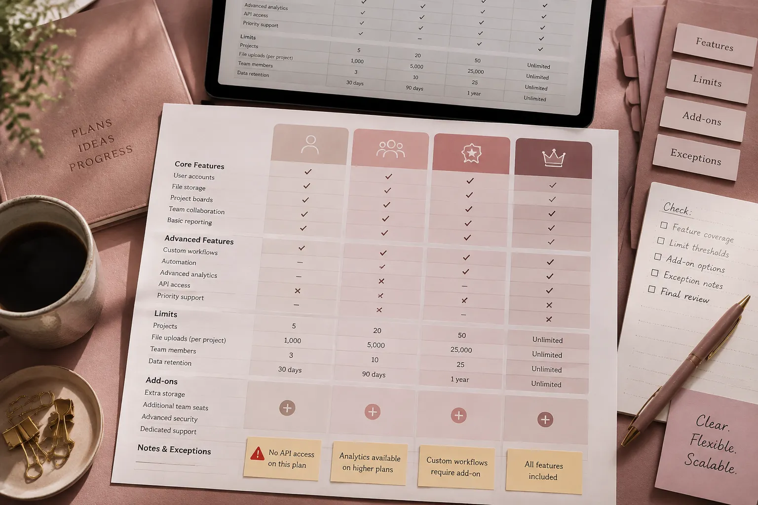
A pricing page becomes difficult to inspect when buyers cannot tell what changes between plans. A checkmark may indicate access, but it cannot show whether that access has a quantity limit, requires annual billing, depends on usage, or carries an additional charge.
A useful SaaS feature comparison table structure shows more than feature presence. It lets a buyer compare entitlements, quantities, conditions, add-ons, prices, and exceptions without reconstructing the offer from scattered labels.
The conventional structure remains a sound starting point: plans in columns, features in rows, and related capabilities grouped into sections. That grid is only the visible layer. Before layout work begins, the team needs a verified inventory of what every cell is expected to communicate.
More specific pages
These pages continue the topic in smaller, more specific directions.
What the comparison needs to show
A plan comparison should answer several different questions:
- Is the capability included?
- If it is included, what quantity or allowance applies?
- Does access depend on usage, billing period, account size, role, or another condition?
- Is the capability purchased separately?
- Are the price or terms determined through a sales conversation?
- Does an exception change the apparent entitlement?
- How is the relevant price calculated?
These questions do not represent the same information type. Feature availability is not a substitute for price calculation. A stated allowance is not unrestricted access. “Contact sales” describes a next step, but it does not establish whether a capability is included, optional, or negotiated.
The main grid should hold information that benefits from direct cross-plan inspection. Longer definitions, pricing formulas, unusual exceptions, and detailed add-on terms may belong in adjacent explanations. The aim is not to force every fact into a cell. It is to keep material differences visible and connected.
| Page element | What it needs to clarify |
|---|---|
| Plan header | Plan identity, concise positioning, and the column to which each value belongs |
| Price block | Displayed price, currency, billing period, and calculation basis |
| Feature group | A recognizable buyer task or capability area |
| Feature row | The specific entitlement or limit being compared |
| Cell state | Availability, quantity, condition, add-on status, or another defined value |
| Exception note | The claim it qualifies, the affected plan, and the triggering condition |
| Supporting block | Details that matter but cannot be read clearly inside the grid |
Start with product truth, then define page truth
Product truth is the complete record of plans, entitlements, limits, dependencies, add-ons, and exceptions. Page truth is the accurate subset presented to a buyer on the pricing page.
Copying the entire product catalog into the table can bury meaningful differences beneath rows that remain identical across every plan. Removing too much detail creates the opposite problem: a simple-looking table that conceals material limits. Begin with the complete record, then decide what must remain visible during comparison.
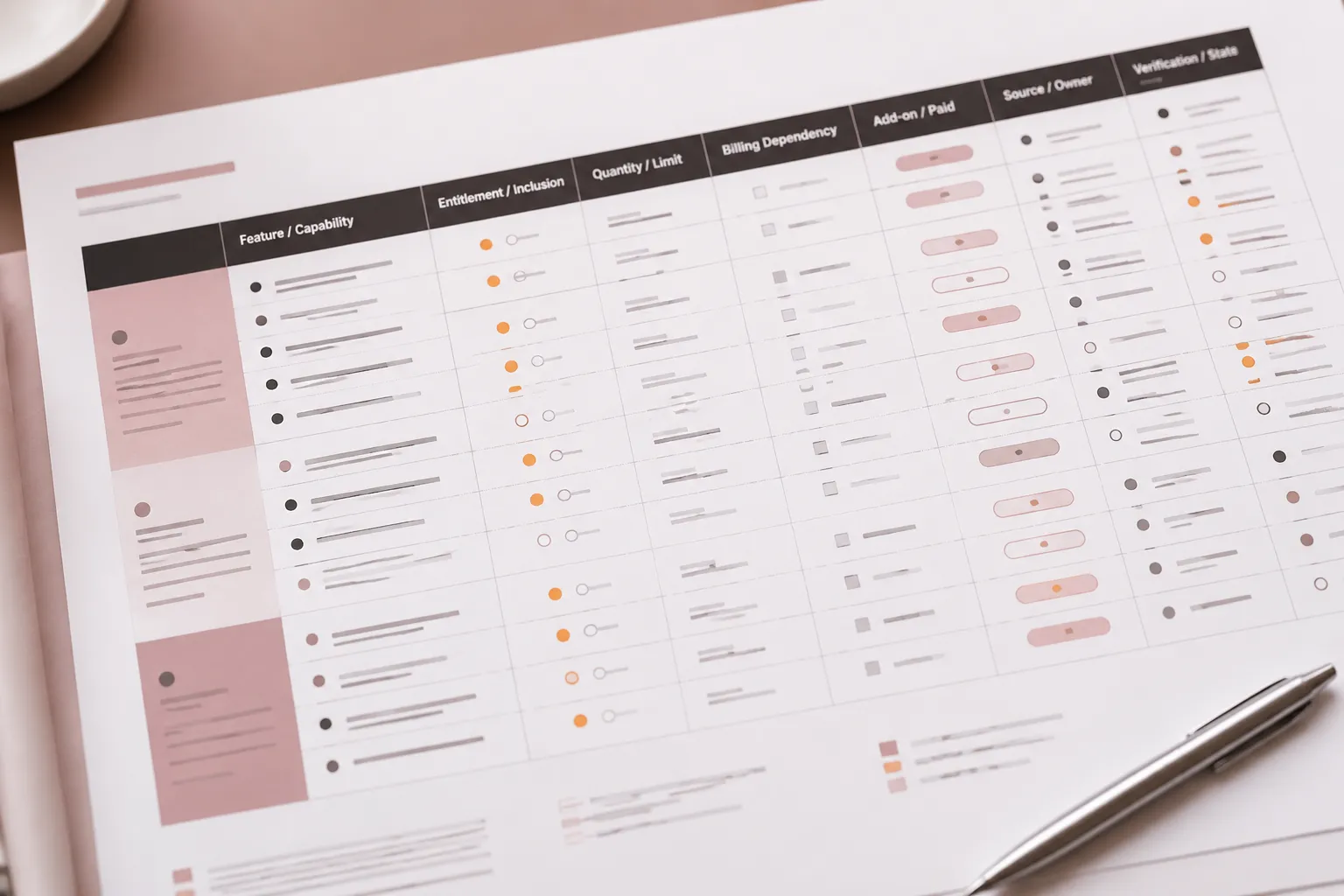
| Field | What the brief must establish |
|---|---|
| Feature name | The current buyer-facing label |
| Category | The task or capability group in which the feature belongs |
| Buyer question | The decision the row helps a buyer make |
| Exact entitlement | What access each plan provides |
| Quantity and unit | Seats, storage, events, projects, credits, history, or another allowance |
| Reset or renewal period | Whether an allowance resets and when |
| Usage dependency | What changes when measured use reaches a stated threshold |
| Billing dependency | Whether access, allowance, or price changes by billing selection |
| Add-on status | Whether the capability requires a separate purchase and which plans qualify |
| Exception | Any condition that changes the visible claim |
| Source owner | The team responsible for confirming the information |
| Verification state | Whether the entry is confirmed, changed, unresolved, or awaiting review |
This inventory is a content-control document, not the final table. It should exist before the team decides how many rows to display or which symbols to use. Current prices, plan names, limits, and add-on conditions should be checked against first-party records close to publication.
Group rows around buyer questions
Pricing table feature grouping should help buyers locate related differences without requiring them to learn the company’s internal product architecture. Depending on the product, useful groups may include core workflows, collaboration, usage and capacity, administration, security, integrations, reporting, support, and service commitments.
These are examples, not a fixed taxonomy. A group earns its place when it collects features that answer a recognizable comparison question. “Collaboration” may help a buyer compare guest access, shared workspaces, approval controls, and participant limits. An internal name such as “Platform Services Module” may be accurate within the company but reveal little about the task.
Lead each group with differences that could affect plan suitability. Keep related entitlements together, use consistent units, and separate availability from quantity when combining them would be ambiguous. Shared baseline capabilities can remain where they set expectations, but they should not dominate the first comparison pass.
Define the cell states before choosing symbols
Binary symbols work only for genuinely binary entitlements. Many SaaS offers require a broader set of pricing table cell states.
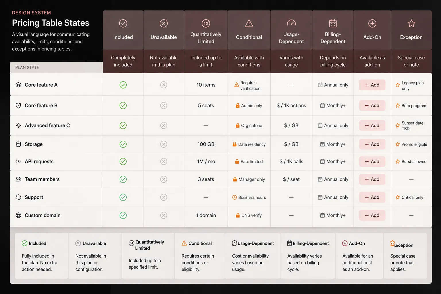
| State | What the cell needs to communicate | Typical content |
|---|---|---|
| Included | The plan provides the precisely named capability | A text label or a defined symbol |
| Unavailable | The plan does not provide the capability | A clear negative state, not an unexplained blank |
| Quantitatively limited | Access is included up to a stated allowance | “5 projects” or “20 GB storage” |
| Conditionally available | Access depends on a defined condition | “Annual billing only” or “Above 20 seats” |
| Usage-dependent | Availability or cost changes with measured use | An allowance plus the applicable usage rule |
| Billing-dependent | Access, allowance, or price changes with the billing selection | A value connected to the active billing period |
| Add-on | The capability requires a separate purchase | An add-on label and an eligibility reference |
| Sales-dependent | The page does not establish the complete price or terms | Known facts plus a clearly limited sales state |
| Noted exception | A qualification changes the apparent entitlement | A concise value tied to a scoped note |
These labels are briefing vocabulary rather than a universal industry taxonomy. Each team must define them against its current product, billing, and entitlement records.
Show quantities as quantities
Values such as “5 projects,” “10,000 monthly events,” “3 administrators,” and “90-day history” expose distinctions that a checkmark would hide. “Limited” is also incomplete unless the limit appears in the cell or is immediately available.
The brief should identify the unit, allowance, reset period, and stated consequence of reaching the limit. It should not infer an overage charge, restriction, or upgrade requirement that the source record does not establish.
Name conditions directly
Conditions need short, concrete labels such as “Annual billing only,” “Requires administrator role,” or “Available above 20 seats.” Vague cells such as “Advanced” or “Eligible” leave the buyer to guess unless nearby text defines them.
If a billing toggle changes prices, allowances, or feature access, every affected value must update consistently. The current billing period should remain visible when the buyer reaches the detailed comparison.
Keep add-ons and sales states distinct
An add-on is a separate purchase state. It may be available across several plans, restricted to certain plans, or priced using another metric. “Contact sales” is different again: it describes how to obtain missing terms, not whether a feature exists.
Known entitlements should remain visible even when price or quantity is negotiated. This keeps confirmed capabilities separate from terms that vary by agreement.
Separate entitlements, prices, add-ons, and exceptions
A buyer may need to answer two questions at once: whether a plan can provide a capability and what that capability is likely to cost under the relevant conditions. One cell may not be able to answer both clearly.
When cost depends on seats, usage, billing period, purchased add-ons, or negotiated terms, divide the information among suitable page elements. The main table can show entitlement, while an adjacent pricing explanation, calculator cue, add-on block, or enterprise note explains the calculation.
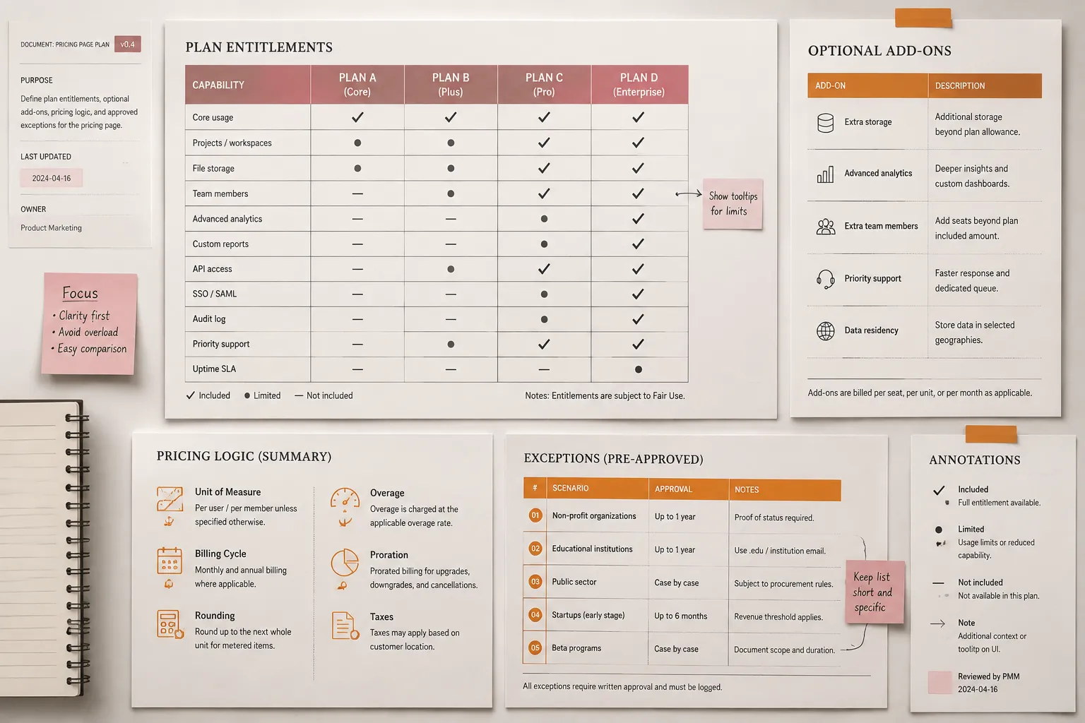
| Information | Likely location | Planning question |
|---|---|---|
| Direct plan entitlement | Main comparison table | Does cross-plan inspection help the buyer? |
| Short material condition | Cell or row label | Would moving it elsewhere make the visible claim misleading? |
| Detailed exception | Scoped note near the affected content | Can the reader identify exactly which claim the note changes? |
| Multi-input price calculation | Pricing explanation or calculator | Which assumptions and inputs must remain visible? |
| Optional purchase | Add-on block with a concise table state | Which base plans are eligible, and what does the purchase add? |
| Negotiated terms | Enterprise note or sales-dependent state | Which facts are known, and which still vary? |
A separate add-on block can show the add-on name, eligible plans, included allowance, additional capability, pricing basis, dependencies, limits, and sales-dependent conditions. Avoid duplicating detailed terms across multiple components unless the publishing process can keep every occurrence consistent.
Keep footnote scope unambiguous
A note may apply to one cell, one feature row, one plan, or an entire category. Its marker and placement should make that scope clear. A useful note identifies the claim it changes, the affected plans, the triggering condition, and whether the effect concerns availability, quantity, price, or timing.
Footnotes should not become a secondary pricing system beneath the table. If many cells require notes before they become accurate, the row labels or state model may be too compressed. Promote material conditions into the visible comparison.
When notes are interactive, their keyboard order and return path need direct testing in the implemented page. Marker style, proximity, and mobile placement depend on the actual component rather than a universal SaaS convention.
Preserve comparison context across semantics and screen sizes
Use an actual data table when the content expresses relationships between plan headers, feature rows, and intersecting values. The markup should allow each value to be associated with its plan and feature rather than relying on visual alignment alone.
The implementation brief should account for a suitable caption, column headers for plans, row headers for features, structurally clear category groups, text equivalents for symbols, logical reading order, meaningful focus order, and visible focus states for interactive controls. Meaning should not depend on color alone.
Native table semantics retain relationships that may need to be recreated when a comparison grid is built from generic layout containers. Even with appropriate markup, the finished component still requires testing with its actual content, interactions, responsive behavior, and supporting technology. Following published guidance informs the work but does not by itself establish conformance.
Choose a mobile pattern from the comparison task
On a narrow viewport, a wide table can lose either plan identity or row context. The mobile pass should begin by identifying which relationships must remain visible together and which information can be revealed progressively.
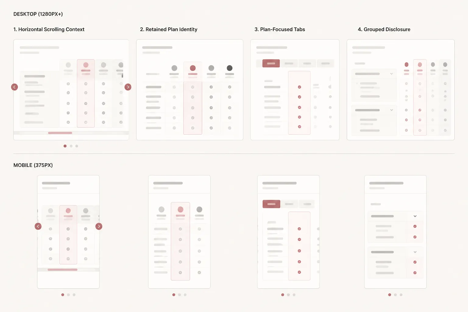
| Pattern | What it preserves | What needs attention |
|---|---|---|
| Horizontal scrolling | The direct table structure | Off-screen columns, overflow cues, and retained row context |
| Selective columns | A narrower visible table | Loss of cross-plan context |
| Plan-focused tabs | More space for one plan | Memory required when switching between plans |
| Grouped disclosure | A shorter first view | Hidden states and additional interaction |
| Accordions | Manageable feature categories | Harder comparison between distant or collapsed rows |
| Repeated plan blocks | A linear reading sequence | Duplicated labels and a longer page |
No single mobile pattern suits every pricing table. The choice depends on plan count, label length, cell complexity, interaction cost, and how important simultaneous comparison is to the buyer’s task.
For horizontal scrolling, keep feature labels available or easy to recover, retain plan identity during vertical movement, indicate that more columns exist, and avoid clipping focus indicators. Confirm that the component has not introduced page-level horizontal scrolling. Long labels, enlarged text, browser zoom, and interactive notes belong in the same pass.
Tabs and accordions change the task rather than merely changing the layout. Tabs reduce simultaneous comparison, while collapsed groups hide differences. Use progressive disclosure only when it preserves the information relationships buyers need under limited space.
Test sticky headers in the implemented component
Sticky plan headers can retain column identity through a long table, while a sticky feature column can preserve row context during horizontal movement. Both behaviors can interact with overflow containers, persistent navigation, billing controls, browser zoom, and short viewport heights.
Inspect the real scroll container, top offset, overlap, background opacity, focus visibility, long plan names, and combined sticky rows and columns. A sticky element should not cover a focused control or consume so much vertical space that the data becomes difficult to inspect.
Sticky behavior is a context aid, not a complete mobile solution. The table still needs coherent relationships, discoverable overflow, readable labels, and meaningful focus order.
Define supporting assets by the question they answer
Supporting elements should clarify a specific comparison problem rather than decorate the pricing page.
- Plan summaries
Introduce the pricing basis, intended use case, and strongest tier distinction. Keep them concise and consistent with the detailed feature rows.
- Tier cues
Help readers distinguish a selected or higher-capability tier without obscuring the other plan headers, prices, actions, or entitlements.
- Add-on blocks
Separate optional purchases from baseline access, especially when an add-on applies to several plans or uses a different pricing metric.
- FAQ assets
Explain recurring questions about allowance resets, seat calculations, billing changes, overage handling, or sales-dependent terms. Material cell conditions should remain in or next to the comparison.
- Pricing explanations
Show a formula, input sequence, or worked structure when likely cost depends on several variables. State assumptions and use current terms.
For each source image or external asset, record its origin, permitted use, required attribution, and modification status before publishing. A source-rights note is a production control; the applicable terms still need direct review.
Turn the model into a brief-ready specification
A useful brief connects each visible element to a buyer question, verified source, and responsive requirement. A mockup may show where a checkmark appears, but it cannot define what the mark means, who confirmed it, or how the same value behaves on mobile.
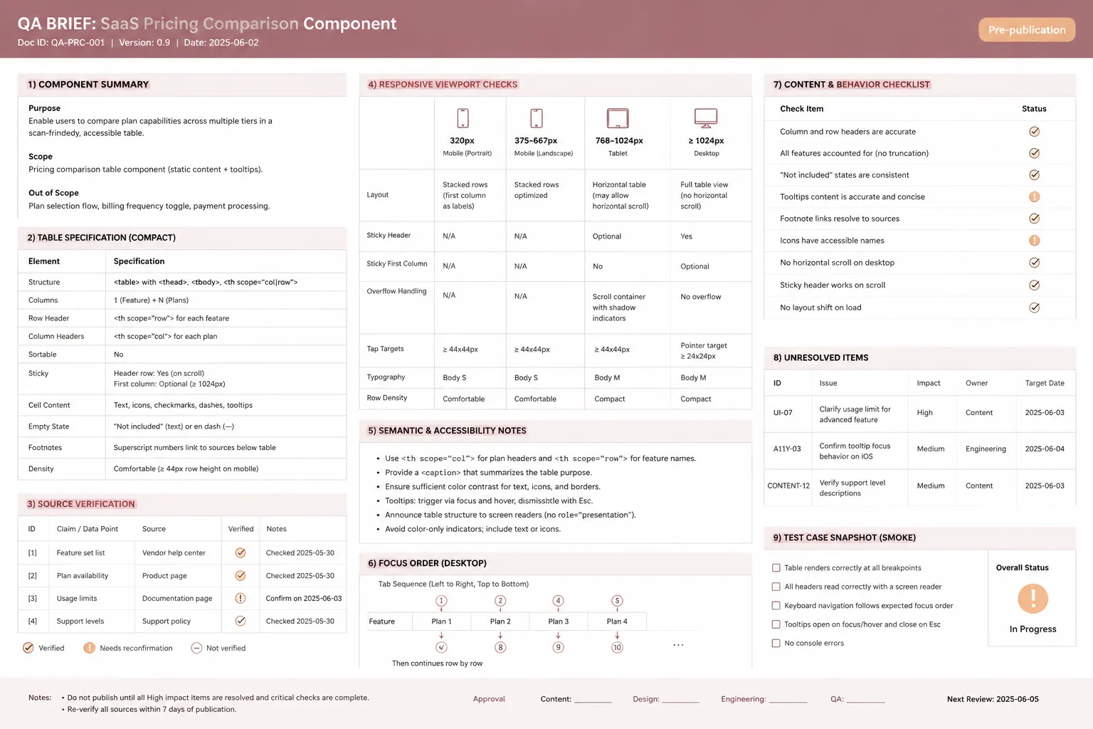
| Brief field | Required decision |
|---|---|
| Buyer question | What the component helps a buyer inspect |
| Content | The exact labels, values, and notes to display |
| Source | Where the current information is confirmed |
| Owner | Who resolves changes, conflicts, or missing terms |
| Desktop behavior | What remains visible and aligned |
| Mobile behavior | How plan and feature context are retained |
| Semantics | How plan, feature, value, and note relationships are represented |
| Interaction | Expected focus, disclosure, toggle, sticky, or scrolling behavior |
| Exception handling | Where qualifications appear and what they affect |
| QA state | What has been checked and what remains unresolved |
Resolve ambiguous inputs before design approval. Flag a row when its label combines several capabilities, its allowance lacks a unit or reset period, or its entitlement changes with billing. Do the same when an add-on relationship is uncertain, a sales state conceals known information, a note has no clear scope, or the table disagrees with current product records.
These are content-model problems. Styling cannot settle them.
Common mistakes to catch in the brief
- Reducing every entitlement to a checkmark: use a binary symbol only when the row is precise and no material limit changes its meaning.
- Treating a lower tier as feature absence: show a smaller allowance or narrower condition when the core capability remains available.
- Hiding add-ons inside higher-tier columns: label separate purchases and identify eligible base plans.
- Mixing price and entitlement logic: separate access from the calculation method when one cell cannot explain both.
- Using vague enterprise language: retain known entitlements while distinguishing prices, quantities, or conditions that vary.
- Letting footnotes carry the offer: move material qualifications into the visible state model.
- Approving sticky behavior from a static mockup: inspect it in the actual overflow and navigation context.
- Copying a competitor comparison format: build rows from the product’s own verified entitlements and buyer questions.
Run one connected pre-publication pass
The final review should compare the rendered page with current product, billing, and entitlement records. Content accuracy and component behavior belong in the same publishing pass because a correct value can still become misleading when its label, billing state, note, or column context is lost.
Offer and entitlement checks
- Confirm plan names, displayed prices, currencies, and billing periods.
- Confirm seat, usage, capacity, and allowance units.
- Confirm each included, unavailable, limited, and conditional state.
- Confirm reset periods, usage rules, feature dependencies, and add-on eligibility.
- Confirm which enterprise terms are known and which vary by agreement.
- Confirm that billing controls update every affected price, allowance, label, and condition.
- Confirm that baseline features have not been presented as tier differences.
Table, mobile, and focus checks
- Confirm that row and column headers identify each value.
- Confirm that grouped sections and symbols remain understandable without visual position or color alone.
- Confirm that every note marker has an identifiable scope and a usable reading position.
- Test narrow and short viewports, long labels, enlarged text, and browser zoom.
- Confirm that plan identity, feature context, and overflow remain discoverable.
- Confirm that tabs and disclosures preserve a meaningful content and focus order.
- Confirm that sticky elements do not collide with navigation, notes, or focused controls.
- Confirm that interactive controls expose their current state.
Publishing checks
- Record who verified the current pricing and entitlement information.
- Resolve or visibly label every remaining uncertainty.
- Remove stale screenshots and obsolete plan language.
- Confirm source-image rights and required attribution.
- Check any named external example near publication rather than relying on an older observation.
- Record the region, currency, billing state, and access date when an external pricing page informs editorial comparison.
There is no universal maximum number of plans or feature rows established by the available guidance. The practical test is whether each plan remains identifiable, each material difference remains inspectable, and the responsive presentation preserves enough context to compare values.