
Dense Comparison Disclosure and Interaction
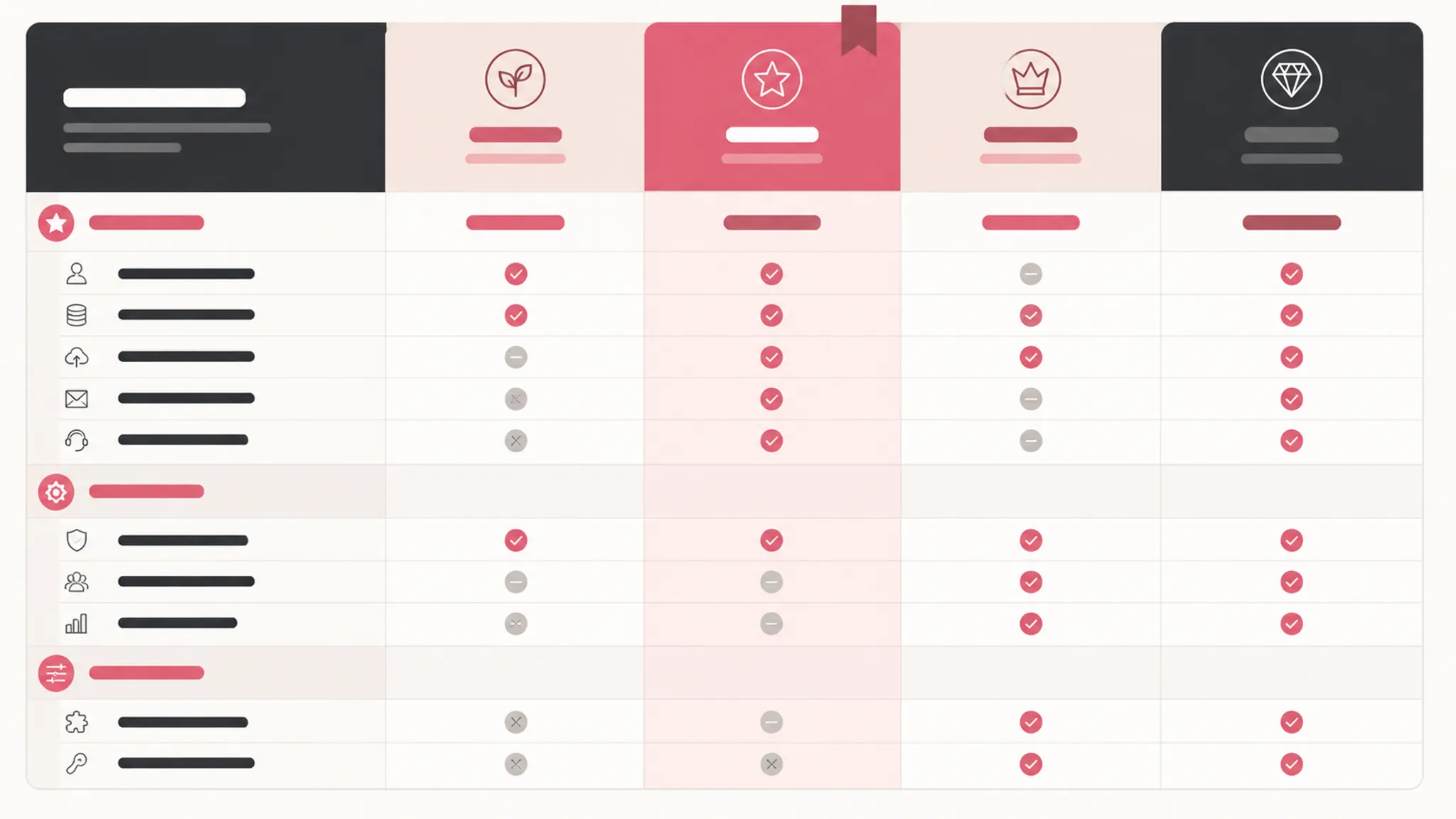
A dense SaaS pricing table has one practical test: can a buyer compare the important plan differences without losing the surrounding context?
When the answer is no, adding more rows or controls will not solve the brief. The page needs a disclosure model that keeps decision-critical information visible, makes secondary details available on request, and preserves plan and feature relationships across desktop and mobile.
Pricing comparison progressive disclosure means presenting the information needed for the next comparison decision first, while keeping the complete feature set available for deeper inspection. It is a planning choice, not a promise of improved business results.
Start With the Immediate Comparison Task
Before choosing an accordion, tab system, sticky header, or show-differences control, define what the buyer must compare immediately.
For most SaaS pricing pages, the first visible layer should establish:
- Plan names and persistent plan identity
- Price and billing context
- Primary usage limits
- Important eligibility conditions
- Calls to action
- Features that separate one plan from another
- Material add-on or availability conditions
This layer is selective, not necessarily short. A feature belongs in the visible decision layer when hiding it would make a plan choice difficult to interpret.
States such as “included,” “unavailable,” “limited,” and “available with an add-on” may need explicit row-level treatment. A vague checkmark can force the buyer to search elsewhere for the condition that changes the comparison.
Begin with the decision, not the number of rows.
Separate Material Facts From Secondary Detail
Secondary details may include supporting capabilities, less frequently compared settings, or workflow-specific functions. These can sit inside labeled feature groups such as administration, collaboration, support, integrations, reporting, diagramming, or security controls.
These are planning examples rather than a universal taxonomy. The right grouping depends on how buyers describe the product and how the plan differences are organized.
Each group should answer a recognizable question. “Administration” can frame account and control features, while “Integrations” can collect connection details that would otherwise interrupt the primary comparison. Avoid groups that simply mirror internal product departments.
The shortcut is to show only prices and feature highlights. That produces a smaller table but a weaker comparison. Progressive disclosure defers specialized information; it does not make material information difficult to find.
Progressive Disclosure Is Not a Pricing Wizard
Progressive disclosure presents important information first and makes additional information available when requested. A buyer can move between rows, plans, and groups according to the comparison task.
Staged disclosure presents a sequence, revealing a subset of choices at each step. A pricing table generally needs the first pattern because side-by-side context supports direct plan comparison.
Turning plan information into a sequence of screens can make it harder to return to a previous plan or verify whether a feature difference explains a price difference. Use a staged flow only when the product decision genuinely requires sequential questions. Table density alone is not a sufficient reason.
Keep Plan and Feature Relationships Stable
A buyer comparing plans needs two kinds of context:
- Which feature row is being inspected?
- Which plan column does each value belong to?
Dense comparisons become difficult when either relationship is unstable. A feature label can drift away from its values, or a plan name can disappear after several screens of scrolling. Mobile transformations create the same problem when columns become cards or tabs without preserving their original identity.
The production brief should define:
- The label for each plan column
- The label for each feature row
- The meaning of every feature state
- The category containing each row
- The billing period attached to each price
- The location of recurring CTA rows
- The behavior when a group expands or collapses
- The behavior when a buyer switches plans on mobile
When the content is genuinely tabular, semantic table structure should preserve meaningful row and column relationships. W3C guidance describes identifiable headers and structural relationships that can support this planning work. That guidance does not establish the finished page's accessibility status; the implementation still requires inspection.
Keep the Comparison State Visible
A collapsed feature group should communicate what it contains, whether it is open or closed, and what action will change its state.
“More” is usually too vague for a dense pricing comparison. “Show integrations” sets a clearer expectation, while “Hide integrations” confirms the next action.
The control should remain associated with the group it changes. On mobile, scrolling and reordered blocks can increase the distance between a control and its revealed rows. The brief should specify that relationship before styling begins.
Plan Disclosure Controls Before Styling
Disclosure interaction is part of the comparison model, not a decorative layer added after the table is complete.
The Disclosure Pattern | WAI-ARIA Authoring Practices Guide provides a useful boundary for specifying the control name, expanded or collapsed state, expected keyboard operation, and focus behavior.
A practical disclosure specification can state:
- The control label identifies the feature group.
- The control exposes whether the group is expanded or collapsed.
- Keyboard users can operate the control using the expected interaction.
- Newly revealed content appears in a predictable location.
- Focus does not disappear after expansion or collapse.
- Collapsed content does not remain in an unexpected keyboard sequence.
- The control can be reversed without forcing a page reload.
Content that is visually hidden may still contain links or controls reachable by keyboard. Include a check for that condition in the publishing review.
Do not import behavior from a navigation menu into an ordinary pricing feature group. The widget context matters. A disclosure control inside a comparison table serves a different purpose from a menu that opens site navigation.
Choose Defaults From the First Question
Keep a group expanded when it contains a major plan differentiator, primary usage limit, important eligibility condition, frequently compared feature, or information needed to understand the displayed price.
Consider a collapsed default when the group contains secondary detail and its label clearly communicates the available content. No supplied source establishes a universal ideal number of expanded groups. Treat the default as a planning hypothesis and review it against the actual table and first comparison task.
Specify Show-Differences Behavior
A show-differences mode can support a focused comparison by filtering or emphasizing rows where selected plan values differ. It should not replace the complete table.
The brief should define:
- Which plans are being compared
- Whether identical rows disappear or become visually quieter
- How the filtered state is communicated
- How the buyer returns to the complete feature set
- Whether collapsed groups remain available
- How unavailable, limited, and add-on states remain understandable
- What happens when only one plan is selected
“Show differences” is more informative than a generic filter icon. If the page also offers “show all,” make the current state apparent and reversible.
A filtered view can remove an important baseline. A feature available in every plan may still explain what the product includes, or provide context for a row whose values differ because of a usage limit. The complete comparison must remain reachable.
Choose Sticky Headers and Fixed Columns for Specific Problems
Sticky headers and fixed columns address different tracking problems.
A sticky plan header keeps plan names or prices visible during a vertical scan. A fixed first column keeps feature labels visible while the buyer moves horizontally across plan columns. A hybrid approach may use both, but neither is automatically appropriate.
The brief should state whether the table uses a sticky plan header, fixed feature-label column, both, neither, or a different mobile treatment.
Then inspect the actual page for:
- Content hidden beneath a sticky element
- Stacking conflicts between multiple sticky layers
- Loss of feature-row context
- Loss of plan identity
- Horizontal movement on small screens
- Touch behavior near the table edge
- Focus visibility near sticky controls
- Row-height changes after disclosure
- Obstruction of prices, labels, or CTA rows
A sticky header can preserve column identity during a long scan, but it can also cover content when the viewport becomes narrow. Treat it as a QA decision rather than a universal solution.
Make Mobile Behavior Part of the Original Brief
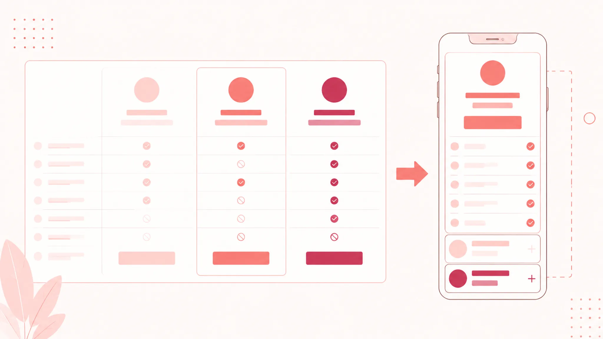
A desktop pricing table cannot simply shrink until it becomes a mobile plan. Horizontal movement, plan tabs, stacked plan cards, or a combination of these patterns each change how the buyer retains context.
Horizontal Comparison
Horizontal movement can preserve the table's row-and-column model. It may also require repeated movement between the feature label and distant plan values.
During a horizontal pricing-table review, check whether:
- The feature label remains available
- The current plan remains identifiable
- The scroll position is understandable
- The table shows a visible continuation
- Sticky elements leave content unobstructed
- Disclosure controls remain reachable
- Focus moves predictably
A desktop screenshot does not validate these behaviors. An implementation tutorial does not validate them either.
Plan Tabs or Stacked Plans
Plan tabs provide access to individual plans without displaying every column at once. The tradeoff is that simultaneous comparison becomes less direct.
If the mobile design uses tabs, specify the active plan state, the method for changing plans, feature-row retention, group state, visible price and billing context, and the route back from a detail interaction.
Stacked cards can make each plan readable but may increase vertical scanning. They should still preserve common row labels, feature-state language, and a practical way to understand differences between plans.
Disclosure on Touch Screens
Expandable groups need enough space for their labels and state indicators. In a mobile pass, verify touch-target placement, visible expanded and collapsed states, return position after closing, and whether opened content pushes important pricing context away.
Where keyboard interaction applies, also verify focus visibility. A sticky price or plan cue should not cover newly revealed rows.
Turn the Table Into a Production Brief
The page brief should connect buyer needs to visible components and review decisions.
Comparison Hierarchy
State what must appear before any interaction: plan names, prices, billing terms, primary limits, main differentiating features, CTA rows, and important add-on or eligibility conditions.
Feature-Group Plan
List each group and the buyer question it answers. Mark whether it opens by default and explain why its rows are secondary or decision-critical.
State Language
Define the terms used for included, unavailable, limited, conditional, and add-on features. Do not rely on icons alone when a condition affects plan interpretation.
Interaction and Responsive Behavior
Document disclosure labels, state changes, keyboard operation, focus behavior, show-differences behavior, and the route back to the complete table. Specify horizontal movement, fixed columns, sticky headers, plan tabs, stacked cards, or the decision to use none of them.
Assets and Trust Cues
An add-on block, FAQ illustration, or explanatory graphic should clarify a pricing relationship rather than decorate an already dense table. The asset brief should state which plan or feature relationship it explains, what text remains visible, whether it is informative or decorative, what alternative or nearby text is needed, where the source image came from, and what rights note accompanies the asset.
A trust cue should support a concrete page question, such as billing context, usage limits, or support availability. Do not add badges or claims the team cannot verify.
Complete the Pre-Publish QA Pass
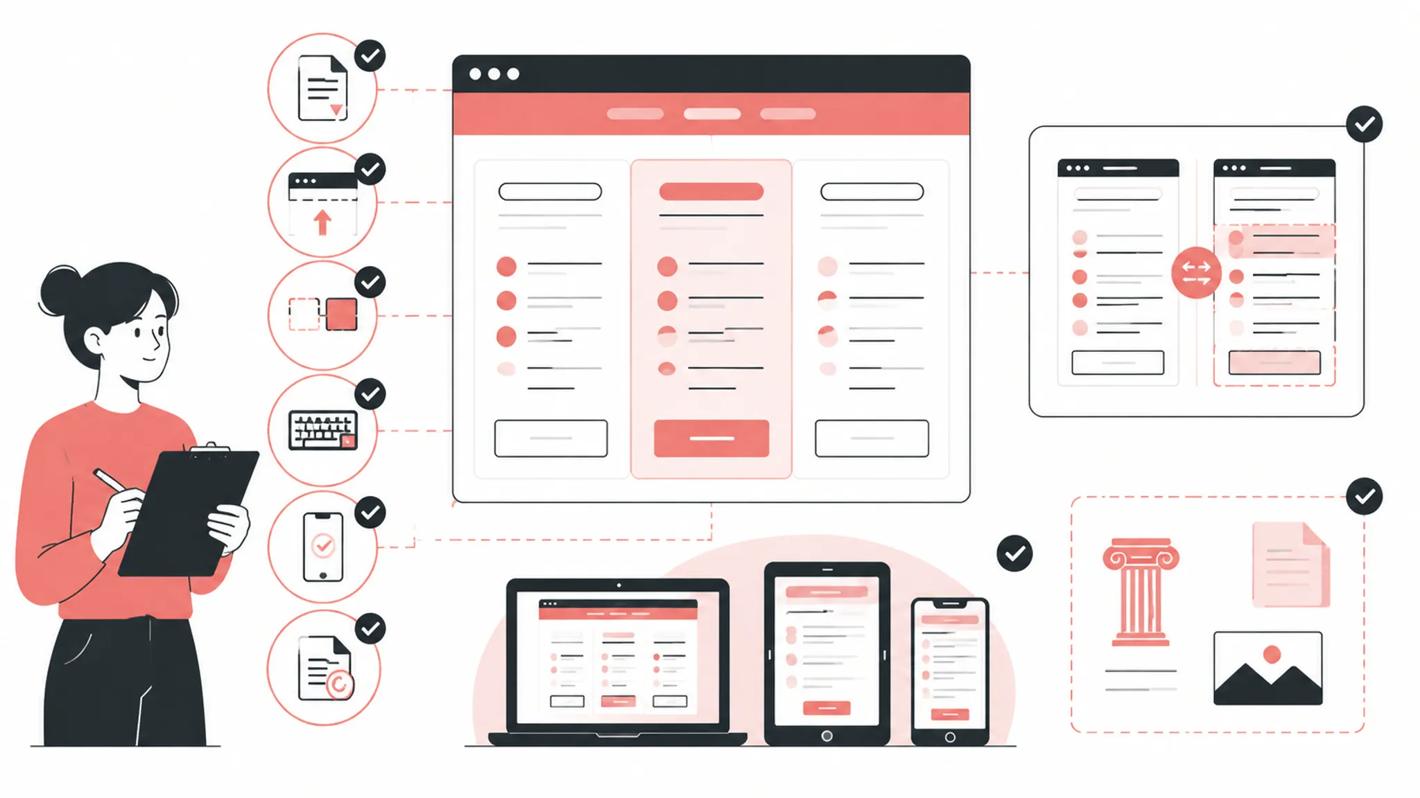
Review the page in the same order a buyer will inspect it.
Desktop Inspection
- Can the buyer identify each plan immediately?
- Is billing context attached to each price?
- Are decision-critical rows visible?
- Do feature labels align with the correct plan values?
- Are feature states explicit?
- Do expanded groups retain their headings?
- Does sticky behavior preserve context without covering content?
- Does show-differences mode communicate its current state?
- Can the buyer return to the complete comparison?
Mobile Inspection
- Is the current plan identifiable after movement or tab switching?
- Is the feature row still connected to its values?
- Can the buyer reach secondary groups without losing price context?
- Do sticky elements leave rows and controls visible?
- Does horizontal movement show a clear continuation?
- Are tabs, disclosure controls, and CTA rows usable at the intended viewport?
- Does the layout remain understandable after text enlargement or zoom?
Keyboard and Semantic Inspection
- Can each disclosure control receive focus?
- Is its state exposed?
- Does the expected key operation work?
- Does focus remain predictable after expansion and collapse?
- Are hidden controls excluded from the active keyboard sequence?
- Are table headers and relationships represented meaningfully?
- Can the buyer understand the table without relying on color or position alone?
These are implementation and publishing tasks. They do not replace a formal evaluation where one is required.
Common Planning Mistakes
Hiding the Primary Difference
If a feature determines the practical distinction between two plans, placing it inside an unopened group weakens the first comparison.
Revision: Move it into the visible decision layer, or make the group label and state unmistakable.
Treating Every Row as Equally Important
A flat list forces the buyer to scan internal product categories before finding the relevant difference.
Revision: Group rows around buyer-relevant workflows, then keep important exceptions visible.
Using Icons Without State Text
A checkmark may mean included, partially available, or available under a limit.
Revision: Define the state in text, a label, or nearby explanatory content.
Adding Sticky Behavior Without Testing Obstruction
Plan names may remain visible while feature text disappears behind the sticky layer.
Revision: Test row movement, stacking, focus visibility, and content clearance on the actual page.
Calling a Desktop Table Mobile-Ready
A responsive screenshot shows appearance, not interaction quality.
Revision: Run a mobile pass covering plan identity, row identity, movement, disclosure, touch, focus, and obstruction.
Treating Commercial Scores as Evidence
Vendor galleries, benchmark labels, and generated scores can supply vocabulary or examples. They do not establish business outcomes or universal usability results.
Revision: Use observable page behavior and a defined QA check.
FAQ: Pricing Comparison Progressive Disclosure
What should remain visible in a dense SaaS pricing table?
Keep plan names, prices, billing context, primary limits, calls to action, and decision-critical features visible. Material conditions should not depend on an ambiguous or difficult-to-find control.
Should every feature group start collapsed?
No universal default is established in the supplied material. Expand groups containing major decision differences or important pricing conditions. Consider collapsing secondary detail when its label clearly communicates what is available.
Is progressive disclosure the same as hiding pricing information?
No. It defers specialized details while preserving access to the complete comparison. Making material pricing facts difficult to locate defeats the comparison task.
Should a pricing table use sticky headers or fixed columns?
They address different context problems. Sticky headers preserve plan identity during vertical scanning, while fixed columns preserve feature labels during horizontal movement. Choose based on the page structure and inspect the result on desktop and mobile.
Is Show Differences enough for comparing plans?
It can support a focused comparison, but it should remain explicit, reversible, and secondary to the complete feature set. Buyers may still need identical rows for baseline context.
How should a team review expand-collapse feature groups?
Check the control name, expanded or collapsed state, keyboard operation, focus behavior, and treatment of hidden controls. Also verify that row and column relationships remain understandable.
What belongs in the visual brief?
Include visible decision rows, feature-group labels, default states, state language, sticky behavior, show-differences behavior, mobile interaction, focus behavior, semantic table needs, and source-rights notes for supporting visuals.
A dense comparison is ready for handoff when the team can explain what stays visible, what can collapse, how the buyer returns to the full table, and how those relationships survive the mobile pass. The remaining questions should be specific implementation or single-check decisions, not unresolved assumptions about the comparison task.
Sources
- Disclosure Pattern | WAI-ARIA Authoring Practices Guide
- Table Pattern | WAI-ARIA Authoring Practices Guide
- Accessible Tables | Web Accessibility Initiative
- Progressive Disclosure
- Comparison Tables for Products, Services, and Features - NN/G
- Designing Effective Pricing Plans UX - Smashing Magazine
- WebAIM: Disclosures and Accordions