
Feature Grouping and Comparison Schema
A pricing table becomes difficult to inspect when it lists capabilities without showing what changes between plans. The first task is not adding more feature rows. It is grouping and ordering SaaS pricing page comparison rows around the decisions a buyer needs to make.
For a buyer comparing plans, the table should answer a consistent set of questions:
- What is included in every plan?
- What changes in capacity, control, or support by tier?
- Which limits apply to the team or account?
- Is a capability included, limited, conditional, or available as an add-on?
- Does the answer remain consistent when billing changes or the table moves to mobile?
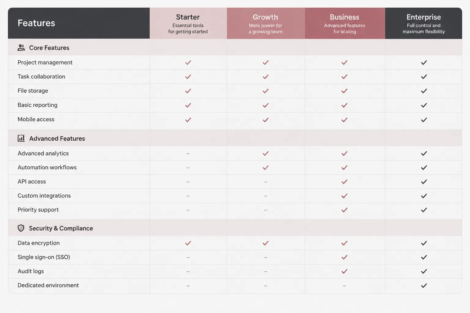
A feature grouping and comparison schema keeps those answers visible through group labels, row order, plan column headings, cell states, billing states, and the mobile comparison flow.
Start With the Buyer Comparison Decision
Each feature row should represent one comparison decision. A buyer should be able to scan the label, move across plan columns, and understand what varies.
Unclear tables often combine independently changing capabilities. “Advanced collaboration and reporting” may describe two different plan differences: one tier might include reporting but restrict collaboration controls, while another might offer limited versions of both.
Split capabilities whenever they can vary separately. Possible rows include:
- Members or seats
- Storage limit
- API access
- Export options
- Version history
- Audit logs
- Single sign-on
- Automation runs
- Support response scope
Short labels work when they still name the capability. “Advanced features” and “More control” leave too much interpretation to the buyer.
A feature row is a comparison unit, not a marketing line.
Build Groups Around Capability Types
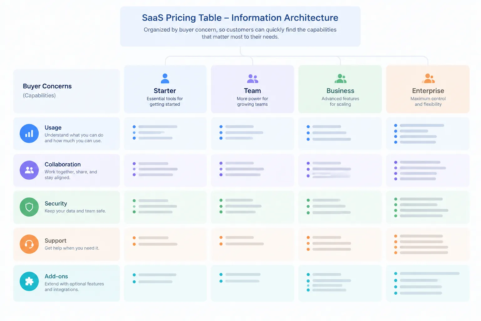
Group labels give a long pricing table a visible structure. They should follow the product’s actual capability taxonomy rather than a generic SaaS template.
Possible groups include:
- Core product access
- Usage limits
- Collaboration
- Integrations
- Automation
- Data management
- Security and controls
- Administration
- Support
- Billing and licensing conditions
- Add-ons
This is not a required category set. A workflow automation product may need automation near the top. A platform bought primarily by IT teams may need security and administration earlier. A smaller tool may not need every group.
The useful question is: what does this buyer need to compare before choosing a plan?
An individual creator and a multi-team platform can require different grouping logic. Role-based pricing feature grouping can work when plans genuinely serve different roles. It becomes confusing when role labels replace capability detail.
Separate Shared Features From Differentiators
Not every included capability belongs in the main comparison matrix. A long list of features included in all plans can push the meaningful differences far down the page.
Use two content layers:
- A concise statement or expandable group for capabilities included in all plans.
- A deeper matrix for pricing plan differentiator rows.
This is a planning heuristic, not a fixed layout rule. Some products have few shared capabilities. Others need a substantial common baseline. The distinction is between confirming coverage and comparing plan differences.
Shared capabilities should not visually compete with storage limits, role permissions, security controls, or support differences that affect a plan decision. Do not hide important qualifiers in the shared-features statement. If a capability has different limits, access levels, or conditions by plan, the relevant qualifier needs its own row.
Define Pricing Table Feature Cell States
Blank cells create avoidable ambiguity. They can mean unavailable, unknown, incomplete, conditional, or simply omitted during publishing.
Define a small, consistent set of feature cell states before the table is designed.
| Cell state | Meaning to define in the brief |
|---|---|
| Included | Available in the plan without a stated limitation in this table. |
| Limited | Available with a named quota, reduced scope, or restricted access. |
| Conditional | Available only when a stated condition is met. |
| Not included | Unavailable within the listed plan. |
| Add-on | Available separately, with plan eligibility stated where needed. |
| Contact required | Details are not published in the table and require a separate sales path. |
The visible label must carry the meaning. A checkmark may be sufficient for a plainly included capability, but it cannot explain a numerical limit, role restriction, or dependency.
“Included” and “Up to 5 users” answer different questions. So do “API access” and “API access with rate limits.” Keep the notation stable across every group. A limited state should not appear as a checkmark in one section and a dash in another.
Order Rows by Inspection Priority
Pricing comparison row ordering should support a scan, not recreate the product navigation or internal team structure.
A practical sequence often moves from the immediate plan constraint toward supporting detail:
- Access and primary usage limits
- Core workflow capabilities
- Collaboration and permissions
- Integrations and automation
- Data controls, security, and administration
- Support and service conditions
- Add-ons, billing, or licensing notes
The exact order depends on the product. A reporting product may put data access first. A developer platform may place API limits and environments before team administration. A collaboration tool may lead with seats, guest access, and permissions.
Do not use internal team ownership as the row-order system. Buyers do not compare plans by the department that built a feature.
A useful review question is: if a buyer reads only the first two groups, do they see the differences most likely to affect plan fit?
Keep Plan Columns and Billing States Stable
Plan column headings need more than plan names. In a long table, buyers need to retain plan identity, price context, and the selected billing state while scanning feature rows.
A billing toggle should change the price state without silently changing the comparison schema. Monthly and annual views should preserve:
- The same plan names
- The same plan order
- The same feature groups
- The same row wording
- The same included, limited, conditional, and add-on states
- The same plan emphasis unless the page explains a real product difference
An annual view that hides rows, promotes a different plan, or changes group labels alters more than billing cadence. It changes the comparison task.
Currency and billing wording should remain visible where the buyer can associate them with the selected price. This matters when a long matrix sits below shorter plan summaries.
Price order and plan emphasis are separate decisions. The available research context is limited for this page task, so plan ordering should remain an inspectable page variable rather than a universal outcome rule.
Design the Desktop Matrix for Cross-Plan Scanning
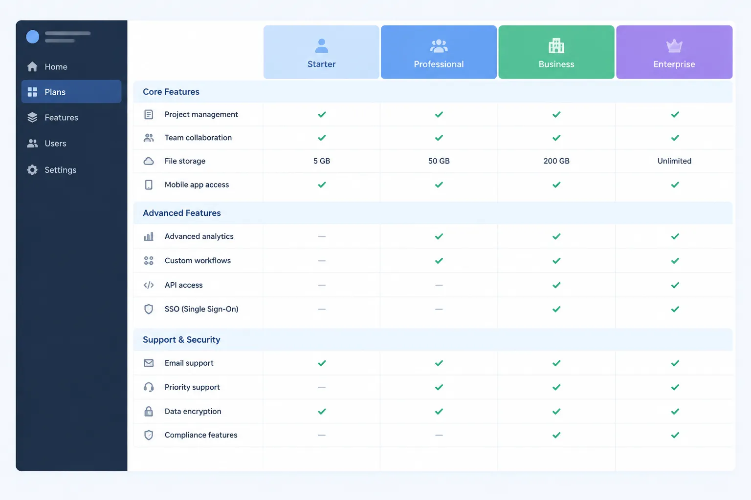
A desktop pricing table can support direct comparison when plan columns, feature rows, and group labels remain aligned.
Before publishing, inspect these relationships:
- Each plan column has a clear heading.
- Each feature row has one understandable label.
- Group labels separate capability areas.
- Cell states remain legible across the full width.
- Numeric limits use consistent units and wording.
- Add-on conditions appear close to the relevant row.
- Any highlighted tier cue does not cover or displace plan information.
- Long tables retain enough plan context during a continued scan.
Persistent context can be useful when the matrix extends beyond the first viewport. A sticky header, repeated plan names, or another persistent plan cue may help preserve orientation. These are implementation options, not proof that every buyer will find the comparison easier.
When the information depends on two-way relationships between features and plans, the comparison should remain a table. Header cells and their associations need review so the row and column relationship is available beyond visual position alone.
That structural check does not establish complete accessibility conformance. It is one publishing requirement among broader implementation and testing work.
Treat Mobile as a Separate Comparison Problem
A desktop matrix does not automatically become a mobile comparison flow by shrinking. Narrow screens change how much plan context can remain visible beside a feature value.
Choose the mobile pattern based on the buyer task.
A horizontally scrollable table can preserve direct cross-plan comparison when:
- Plan columns remain identifiable during horizontal movement.
- The feature label stays associated with visible values.
- Overflow is noticeable rather than hidden.
- All columns are reachable without losing the current group context.
A collapsed group pattern can reduce page length when:
- The group heading remains meaningful while collapsed.
- Hidden rows are discoverable.
- The open state does not make plan identity disappear.
- The buyer can still compare values across plans.
A feature-led or role-led sequence may suit a smaller plan set or a guided selection path. It should not replace the matrix when buyers need repeated cross-plan checks across many capabilities.
A mobile comparison flow needs its own QA pass. Check:
- Plan name and tier cue
- Currency and billing state
- Group label visibility
- Row-label wrapping
- Horizontal overflow behavior
- Column-to-value association
- Keyboard focus order
- Collapsed-content discovery
- Add-on and conditional state wording
- Return path to a plan summary or selection action
Mobile is not merely a responsive breakpoint. It is a different inspection environment.
Use Supporting Assets to Clarify, Not Duplicate
A pricing page may use plan cards, add-on blocks, FAQ assets, or compact illustrations around the comparison table. Each element should have a distinct job.
Plan cards can introduce the tiers and their broad audience fit. The detailed matrix can show feature-level differences. An add-on block can clarify optional capacity or modules. FAQ content can address recurring questions about billing, limits, eligibility, or plan changes.
An illustration should not carry the only explanation of a limit or availability condition. A visual asset can reinforce a group or explain a workflow, while the table or adjacent text preserves the comparison detail.
For every supporting asset, define:
- The buyer question it addresses
- The nearby pricing state it must match
- The group or plan it refers to
- Whether it includes product-interface imagery
- Source-rights notes for supplied imagery
- Alternative text or adjacent text responsibility
- Mobile placement and crop behavior
An asset is brief-ready when its message does not conflict with the table.
Write the Schema as a Content Brief
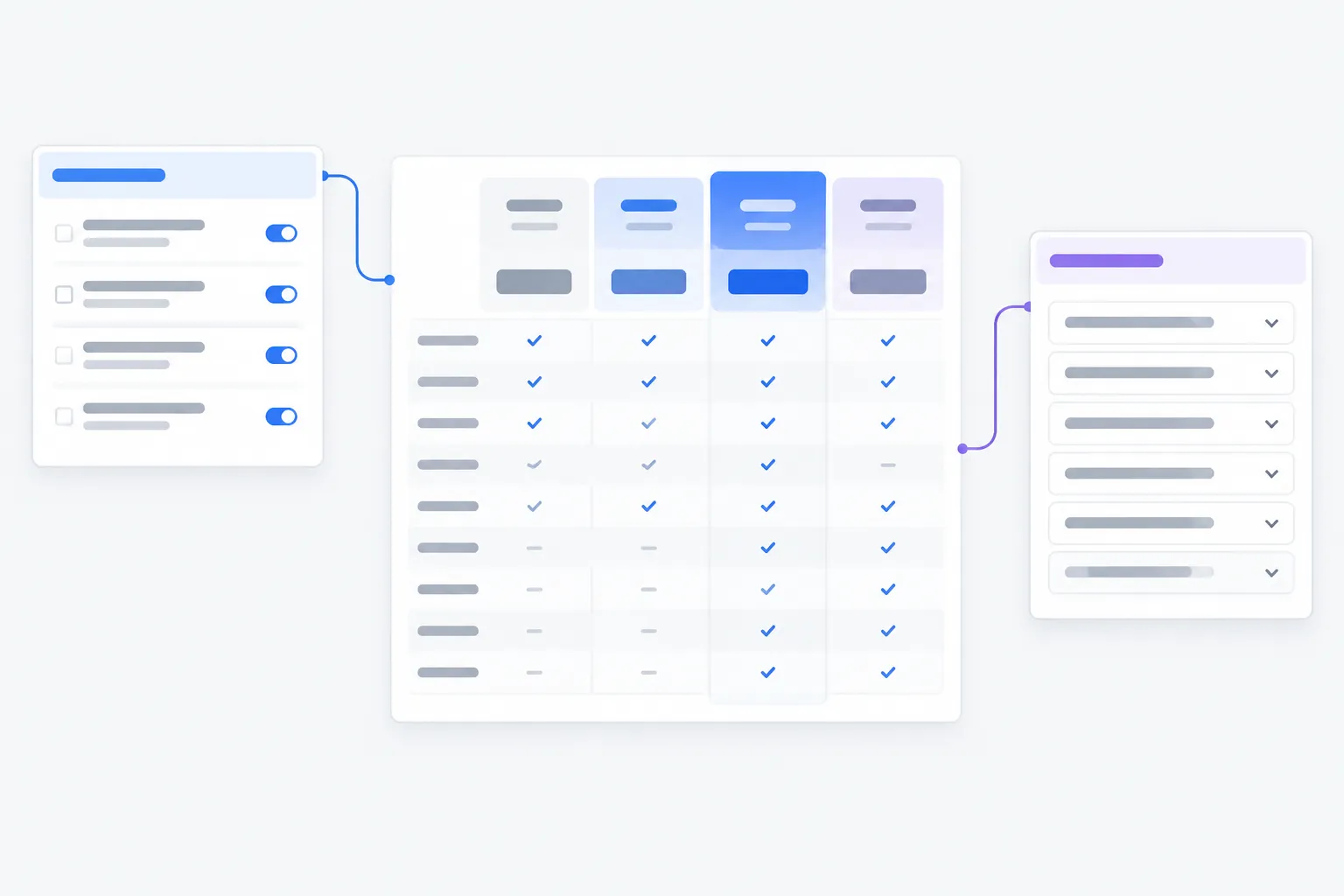
Before design or implementation, write the comparison schema as a content brief. This prevents the visual design from becoming the first place where pricing logic is decided.
| Brief field | What to decide |
|---|---|
| Buyer comparison decision | The plan choice or constraint the row helps inspect. |
| Group label | The capability area shown to the buyer. |
| Feature row label | A concrete, independently variable capability. |
| Shared or differentiating | Whether it belongs in common coverage or plan comparison. |
| Cell states | Included, limited, conditional, not included, add-on, or another defined state. |
| Plan value | The exact quota, permission, condition, or availability text. |
| Billing dependence | Whether the row changes by billing state. |
| Mobile behavior | Scroll, collapse, sequence, or another defined interaction. |
| Supporting explanation | Tooltip, FAQ answer, note, or no extra explanation. |
| Publishing check | Content, semantic, visual, and mobile verification needed. |
Common Schema Failures
Mixing Unrelated Capabilities in One Row
A combined row can make a plan look more complete than it is. Split rows whenever capabilities can vary independently.
Using Vague Group Labels
“Advanced” and “More” do not explain the comparison area. Use labels such as Automation, Security Controls, or Support Scope when they match the product taxonomy.
Treating Checkmarks as Complete Answers
A symbol cannot explain usage limits, prerequisites, or partial availability. Define the cell state and show the qualifying text.
Repeating Shared Features Through Every Group
Repeated common coverage can bury meaningful differences. Keep shared features visible, but do not let them dominate the differentiator matrix.
Letting a Billing Toggle Alter Table Meaning
A billing control should change pricing state, not silently alter feature access, group ordering, or plan emphasis.
Compressing the Desktop Matrix Onto Mobile
Smaller type and narrower cells do not resolve the loss of plan context. Select and test a mobile comparison pattern deliberately.
Verify Before Publishing
Run one content pass and one interface pass.
Content Pass
- Confirm every row maps to one buyer comparison decision.
- Confirm group labels match the product’s capability taxonomy.
- Confirm shared capabilities are separated from meaningful differences.
- Confirm each cell state has a defined meaning.
- Confirm limits, conditions, and add-ons use concrete wording.
- Confirm monthly and annual states preserve the same comparison schema.
Interface Pass
- Confirm plan column headings remain associated with values.
- Confirm group labels remain visible enough for a long scan.
- Confirm table semantics and header relationships are reviewed.
- Confirm overflow, sticky behavior, or collapsed content can be discovered.
- Confirm mobile interaction preserves cross-plan meaning.
- Confirm supporting assets, FAQ explanations, and add-on blocks match the table.
The goal is not the longest pricing table. It is a schema that makes relevant plan differences possible to inspect, compare, and verify before a buyer has to infer missing meaning.
Sources
- Tables Tutorial | Web Accessibility Initiative (WAI) | W3C
- Tables with One Header | Web Accessibility Initiative (WAI) | W3C
- Comparison Tables for Products, Services, and Features
- Designing Effective Pricing Plans UX
- Price Order Effects on SaaS Pricing Pages
- Bridging the state-of-the-art and the state-of-the-practice of SaaS pricing: A multivocal literature review